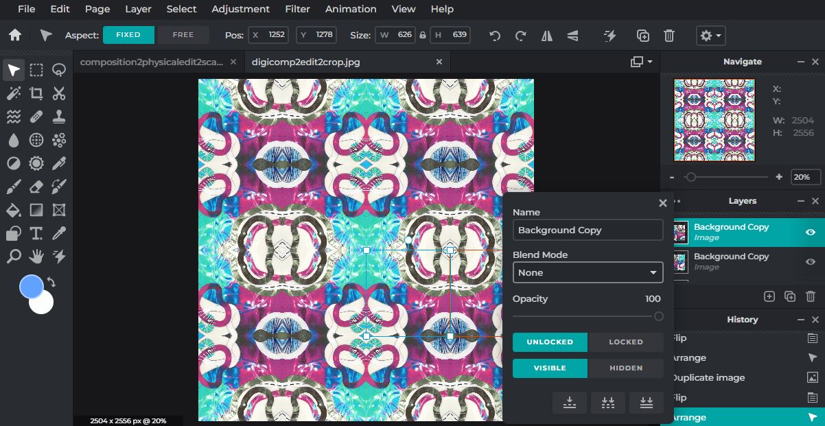
PERSONAL PROJECTS: PORTRAIT & IDENTITY // CONCEAL & REVEAL
Initial ideas & thoughts
Portraiture: |
Identity: |
Conceal & Reveal: |
Why these quotes?
For me, the first quote is a perfect summary of what portraiture is, feeling. It says that the photographic techniques don't need to be complex, as long as what the photograph is reflects an emotional reaction in the viewer, like a simple picture of a soldier during a war, or a child in need. It makes you wonder whether a natural capture of a moment or situation in a portrait, is more meaningful than an artificial creation in terms of interpretation and reaction. The second quote is a reminder that identity is personal, and no two people will ever be same, which is the same in photos or paintings. It also, for me, shows the freedom someone has in the way they are captured in a portrait. The third quote reminds me of emotion and fragment, because you can either cover the parts of the image that show emotion, or show the subject embracing their true feelings with no distortion.
Portrait photography is "a type of photography aimed toward capturing the personality of a person or group of people by using effective lighting, backdrops, and poses".
Portrait photography is "a type of photography aimed toward capturing the personality of a person or group of people by using effective lighting, backdrops, and poses".
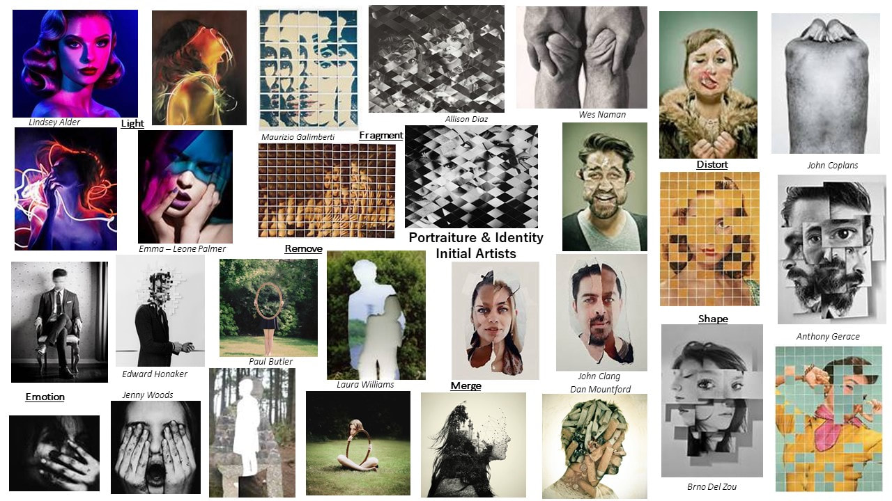
Initial Research - Word Mind Map & Videos

|


|
Initial Research - Photographic Techniques

Initial Research - Experimental Portrait Photographers
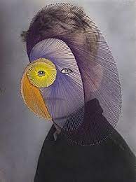
Artist Investigation / Emma-Leone Palmer


|
Why did I choose this artist?
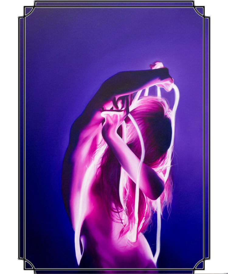
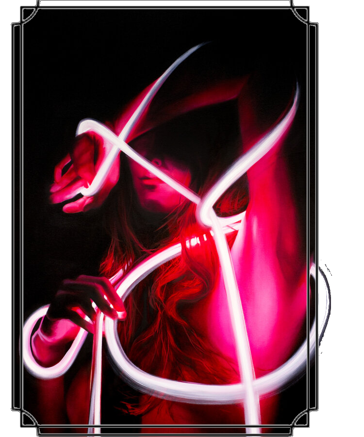
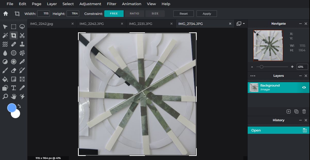
Emma-Leone Palmer is a painter who uses photography as a base for her work, similar to Dennis Wojtkiewicz in the last project. She has released several series of paintings over the years including through the pandemic, including the 'Afterglow' series, which is what I will be focusing on, which she describes as an "exploration of the human mind". This artist inspires me because I like how she manipulates light, and how it is more interactive than it was last project, where the extent of my experimentation with light was slightly modifying it to photograph a pinecone or a slice of fruit. If I were to emulate her work, my options would be vast in terms of how I use light drawing to create a portrait, including highlighting to conceal and reveal parts of the subject. This artist links with this project because she often conceals the model's face to perhaps hide their identity, and uses the light drawing to reveal these rope like lines (the meaning of these lines depends on the intent of that artist for the image- feeling trapped or scared). Technical Processes: Emma-Leone Palmer uses light drawing, which is the process of moving a light source whilst taking a long exposure photograph, where the shutter speed can range from 10-30 seconds. She also uses colour gels, which are "transparent coloured pieces of material placed over light sources to create colourful effects in photography". Emulation: If I were going to emulate this artist's work I would do it in a dark room with a plain, black background. I would probably use a faint light with a colour filter over it, and I would use a glow stick or a light wand to make a swirl of light around the subject. "If my art makes someone stop and think for a minute, or makes them feel alive in their reality, |
Here is an about page on Emma-Leone Palmer:
|
Artist Investigation / Lindsay Adler


|
Why did I choose this artist?
"Lindsay Adler is an American portrait and fashion photographer based out of Manhattan, New York. Her editorials have appeared in Bullett Magazine, Zink Magazine and Fault." She is also present on social media, including her own YouTube channel where she posts behind the scenes content from her work. I chose this artist because I liked how lively and non-traditional her portraiture is, and I think it would be fun to emulate because I get to interact with the composition more than I could in the abstract nature project. I like how she uses a mix of harmonious and contrasting colours when she layers, as well as using a contrasting background to make the subject stand out more. For this project, her 'Editorial Beauty' collection is the most relevant, and also contains my favourite selection of outcomes from her. Technical Processes: Lindsay Adler uses colour gels in her work. To use this technique in your photography, you could use a camera filter, coloured light, a projected image, or a transparent coloured material. Using this technique can allow the creator control over the parts of the subject that are key. Emulation: If I were to emulate this photographer's work, I would probably use coloured cellophane over my camera lens or use a torch with a coloured filter to light from another angle. I would use a dark background and use two harmonious colours to create a cross across the subject's face. "As a photographer I consider myself a visual problem solver" |
Here is an about page on Lindsay Adler:

Her YouTube account (copy and paste link): https://www.youtube.com/user/AdlerPhotoWorkshops/videos
|


Emma-Leone Palmer & Lindsay Adler

|
Emma-Leone Palmer and Lindsay Adler are two artists who manipulate light to create vibrant, interesting compositions for the viewer. They both use colour gels in their work. They both have block backgrounds which feature no detail, so their subjects stand out.
I prefer the work of Emma-Leone Palmer, because the ability to draw whatever you want to change the interpretation of the portrait seems interesting. I also think it links more with the Conceal & Reveal aspect of our project. To combine these two artists, I would use colour gels to colour over my subjects face, and then use a light drawing to conceal certain facial features. |

|
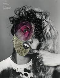
SEMI Analysis / Lindsay Adler
|
Subject:
The photographer of this image is Lindsay Adler, an artist who specialises in portraiture, specifically colour gels. The title of this photograph is not given, because it is taken directly from her website, in her 'Editorial Beauty' series. The genre of this photo is portraiture, which is why I am using it in this project. Elements: There is only one subject in this photo; positioned in the middle foreground taking up most of the frame. There are no props and a simplistic composition, something I will be replicating in my emulation. The rule of thirds highlights the cheekbone, chin, nose & hair for this particular image. The viewer's eye is lead around the photo because of the composition & perspective Lindsay Adler has used. This photo has been taken from a level view, as is most portraiture because it is the most sensical perspective to shoot from, but it is still effective. Adler employs a range of visual elements in her work. The most striking elements are colour & space. The colours in this image are harmonious, and the purples and pinks work in a gradient for a clean & steady flow. The model has dark hair, makeup, and clothes, which I think was done intentionally because it eliminates distraction from the coloured skin. The background is a solid colour that matches, but only involves one colour for simplicity. the hues on the face outline the prominent facial features like the cheek bones and the eyes because of their high saturation. Personally, the colours on the cheek bones and how they are arranged, remind me of the contour lines you would find on a map in geography. The most distinguished colour used in this photo is a vibrant pink, that enhances the composition. Media: The photo has been taken from a short distance to conceal the background and have the model's face in the main field of view, which is the main focal point for the reader as they explore the image. For this image, there isn't necessarily a distinguished middle ground, and there's little negative space (background) around the subject. The model is in the foreground, and I think the coloured lines contouring her face as previously mentioned, |
This is my chosen photograph; which has no given name:

|


act as leading lines. This photo has been taken in a studio with professional equipment, and I think she has used fluorescent lighting, so she could easily dictate the direction and strength of the light. The light source will have been placed in front of the model to cover her skin and avoid a silhouette, and I believe a solid-coloured light source is placed behind the model to cast over the background. Because you are able to see the model, the image is less ambiguous and there is added personality to the subject. The viewer is able to interpret her emotions with this added layer of clarity. To emulate this photograph myself, I would use a camera with an aperture f8, ISO 200 (or AUTO) and an adjustable yet fairly quick shutter speed. I would have a light with a brightness of around 1/16, which I would place my colour gels over. I could also use an LED RGB light for easier colour customisation. I would use a white background and place my model in front, with a coloured light in front and behind. Additionally I would need to research how to project/blend colours onto the skin, because so far I have only experimented with silhouettes.
Intent:
In my opinion, this photo conveys a message of surprise or shock. I would say exhausted due to the subject's facial expressions, however the colour gels don't associate with sadness or weary as much as blue or black perhaps. The photo is definitely filled with a powerful element of emotion, which I think is emphasised through the close-up, level point of view the photo is taken from, as well as the revealed expressions which showcase some form of concern (revealing emotions links in with our conceal and reveal theme in the project). If i were going to recreate this shot, I would provide the viewer with a little more clarity in the link between the model and the other elements of the composition. Adler mentioned in a YouTube video that she photographs women to capture their elegance.
These are some screenshots from a behind the scenes video of Adler, which showcase a basic process from one of her shoots:


"Photography is an international language. No matter who you are ,where you are, or what language you speak,
I can connect with you"
SEMI Analysis / Emma-Leone Palmer
|
This is my chosen photograph from the 'Afterglow' series:

|
Subject:
The photographer is this image is Emma-Leone Palmer, and the name of this oil painting is VoodooRay, and it was made during the pandemic period. The genre of this painting is portraiture. Elements: The composition shows the subject placed in the middle ground using rule of thirds, the main four coal points highlighting the light rope as it coils around the model. She is positioned with her arm concealing her eyes and her body entangled in a rope-like light source, which is the central theme of the painting. The viewer's eye is lead around the painting because of the composition and perspective Palmer used when taking her reference photo. She has taken this form a level perspective, this angle is commonly used in portraiture. The most striking elements in this piece are colour and space. The subject is completely surrounded in negative space, even the background isn't coloured. This is effective because for me, it seems like the subject is trapped in the darkness, or perhaps, trying to concealing herself from the exposure of the light cords revealing her to the prying eyes of the viewer, and doesn't want to be stared at and interpreted (which links to our project). Unlike other prices from this artist, this image only contains only colour, |
pink with a variation of shades. I am not sure of there was a tactical reason for this choice, but it does make the composition less complicated.
A link to a brochure Palmer published regarding her work:

|
Media:
The original photo was taken from a short distance, so you can only see the model's top half, and the main focal points highlight the light rope as it coils around the model. The viewer's eyes are inclined to follow the light cord around the piece (the leading lines), because they are bold and vibrant. I think the background has been deliberately excluded from detail as to not draw attention away from the main part of the image being the model. Maybe she is frightened of the dark, and is using the light to protect herself, because the way she is positioned, she looks weak and timid, like she's cowering. To create her hypnotic pieces, Palmer uses "pliable lighting strips and neon wires" to create her light drawing effect. There is no other lighting involved, and the lighting looks lazily thrown about the model, The atmosphere composed in this piece is of distress and lack of control, and the viewer is left contemplating what the sensible observation is to the message of the piece. To emulate this photo myself, I would use a dark room (probably the closet in the art room), wrap a person in some neon strip/ LED light, and photograph with an ISO of about 400 and a slower shutter speed. I would also use manual focus. Intent: Emma-Leone Palmer said that she uses light to portray "connections, feelings, or thoughts of the human mind". I like the ambiguity in this piece, but yo improve it, I would perhaps add further colour in the light drawing aspect to complexity. |


These are some snips from a video detailing a basic timeline of Palmer's process in creating her paintings:


"If you're passionate about something, you become an expert, because your curiosity will take you there"
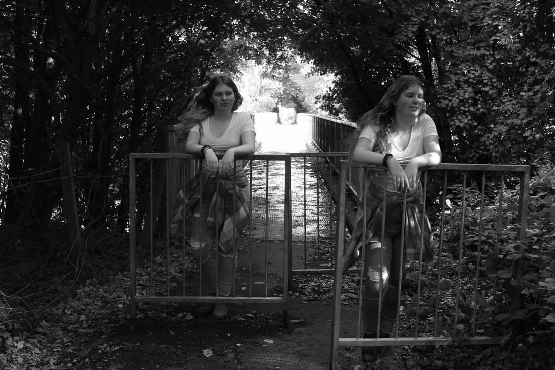
Trip to UCLan / Photography and Animation Workshop
|
I went on a trip to UCLan, where I experienced a campus tour, an exclusive view of the degree show, and took part in two workshops surrounding photography and animation. In the morning session, we planned a storyboard and made a short animated sequence about university life using fruit props and background photos. In the afternoon session, we interpreted several images of teenagers wearing prom outfits they were unable to use due to the pandemic, which I thoroughly enjoyed participating in. We then took some of our own portraits, with no specific plan using a basic iPad camera and editing software. I am however, impressed with the results from the miniature shoot. After each workshop, we shared out outcomes with the rest of the groups, and then saw some real student examples of different animations and original photographs. On the right, you can see the photo I took for my improvised portrait.
|

|
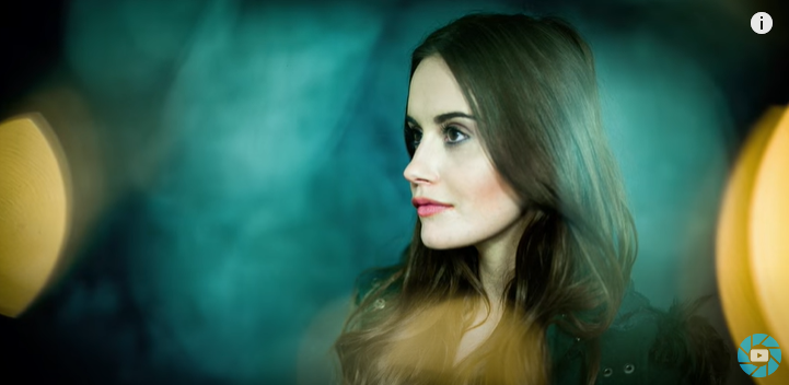
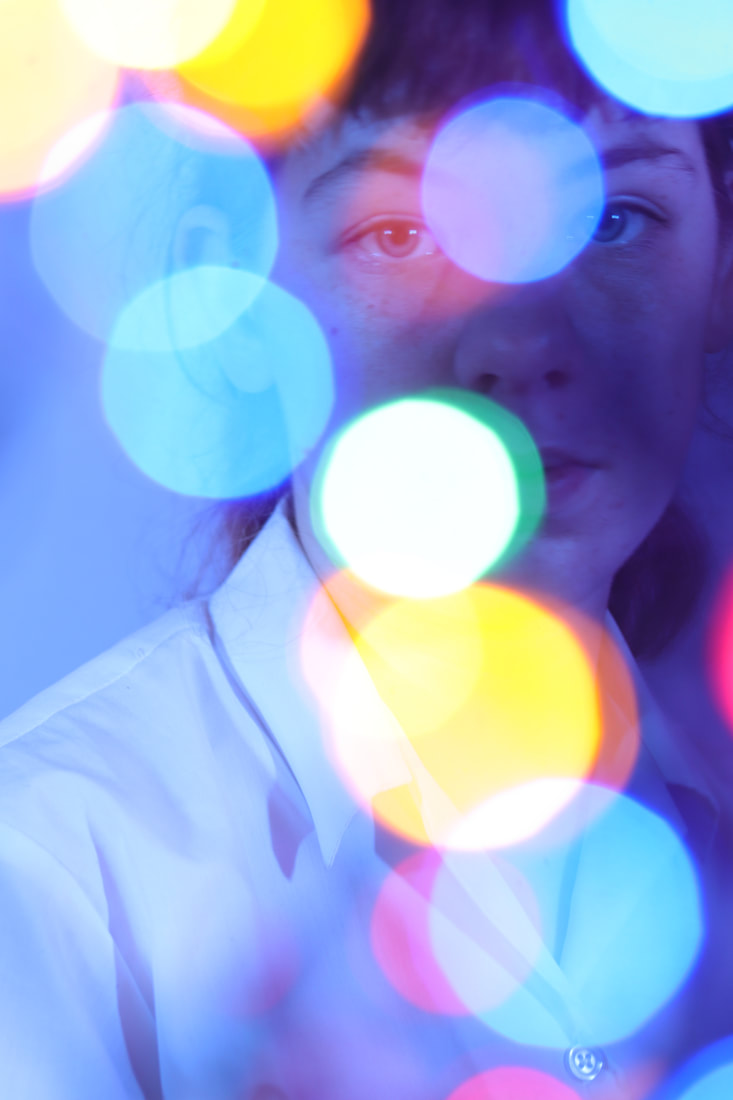
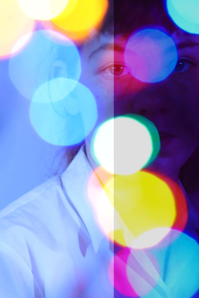
Experimenting with Light : Bokeh Workshop
|
A video explaining how to create a Bokeh outcome:
Set-up for our own Bokeh shoot (front bokeh):
|
Name of technique: Bokeh
Bokeh is intentionally blurring the background of image (a soft focus background) and having a shallow depth of field. The subject is the main focal point of the image, and is usually the only clear object in the photo. The camera lens renders out-of-focus points of light. Re-creating this technique: Bokeh You will need some small LED lights that you can get from any crafts shop, a basic tripod, and a camera lens with a wide aperture (like a prime lens). The camera is on a tripod because the shallow depth of field makes the camera prone to camera. You can also use a shutter release cable to avoid unintentional blur. By putting your lights in front of the subject, you add depth to the image. The shutter speed should be fast (about 1/90), and the ISO low (100-40 depending on setting). Hold the lights in front of the model and adjust to taste. Make sure you use manual focus to focus on the subject and not the lights. One of the final images from the video:
|


Some snips from the video explaining the process (how to carry out this shoot in a home or studio setting):


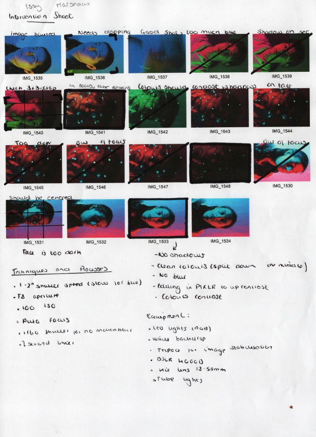
Experimenting with Light : Bokeh Contact Sheets
Using contact sheets makes it easier to choose the 4 images I need to edit from my 9 best images, as well as making it easier to edit my images, because I have already labelled what should be cropped or changed. it also helps me keep track of my constant strengths and limitations in my shoots, so I can develop my skills in the future. Writing the technical processes and equipment is a good reference if I wish to produce similar outcomes in the future. I go through my images online and annotate them on paper, this makes it easier to pick between images that appear very similar.

|

|
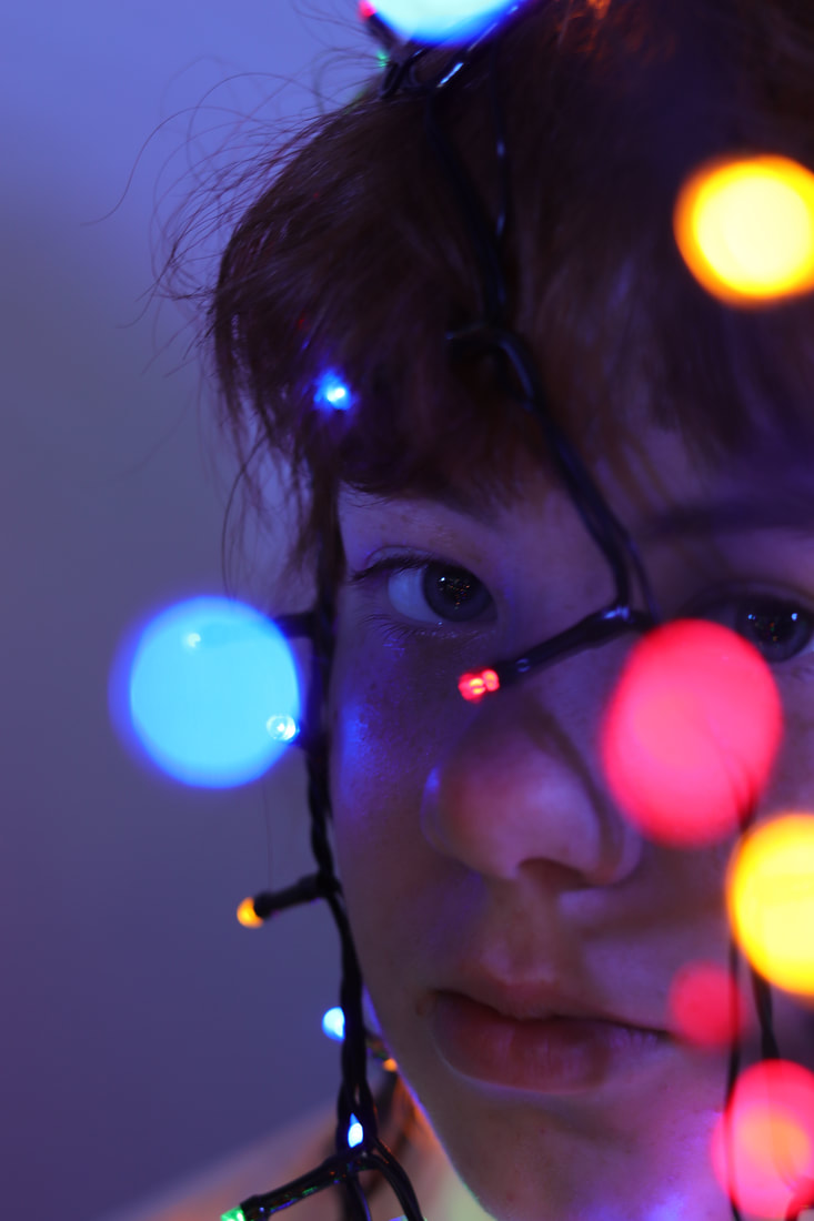
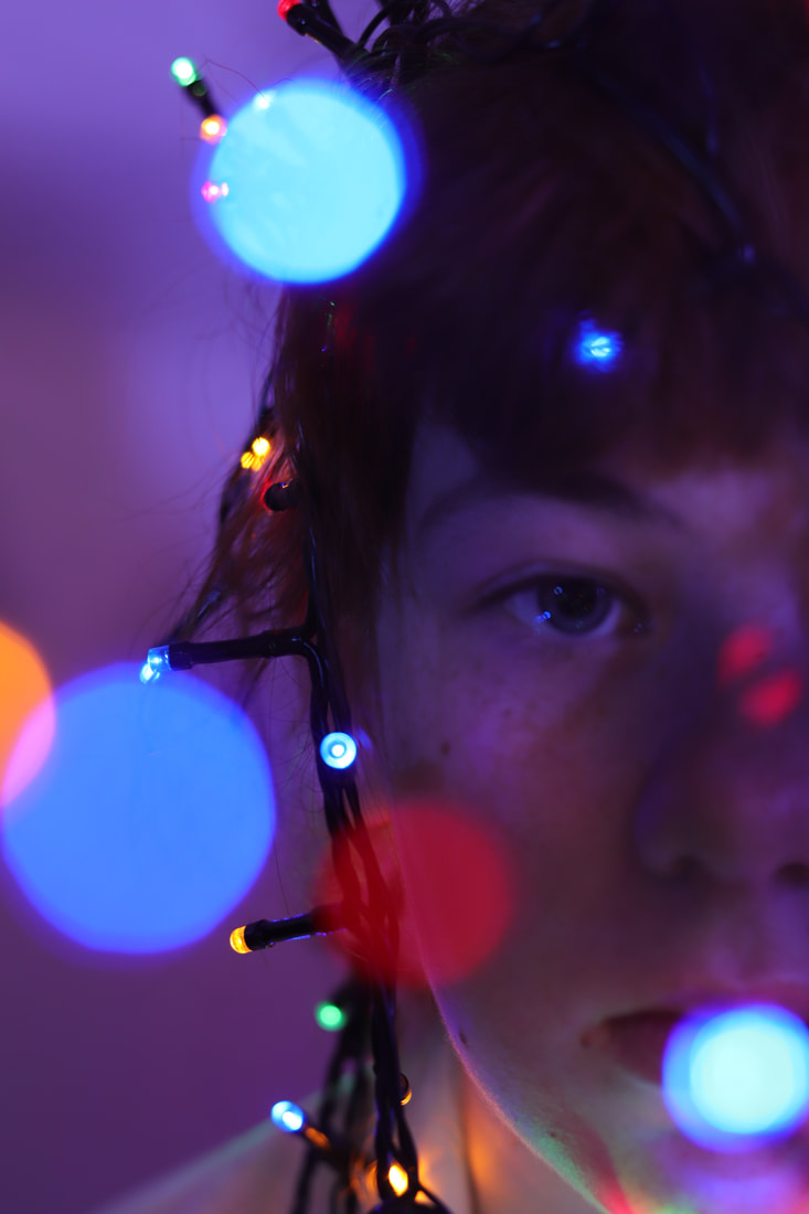
Experimenting with Light: Bokeh Workshop 9 Images
Two of these images were taken using a light wand, but they were still apart of the shoot and this method was highly effective:
|
|
|
Some of the most common tools used in this process and examples of their effect on these images - the editing process is explained more in the image evaluations:
|
I used the crop tool to remove unwanted space and zoom in on focal points:

Levels tool to help even out exposure:

|
Used the exposure tool to deepen the colours from the background especially because it was pale:

i used the vibrancy tool to make the colours richer:

|
Experimenting with Light : Bokeh Workshop 4 Edited Images

|

|
|
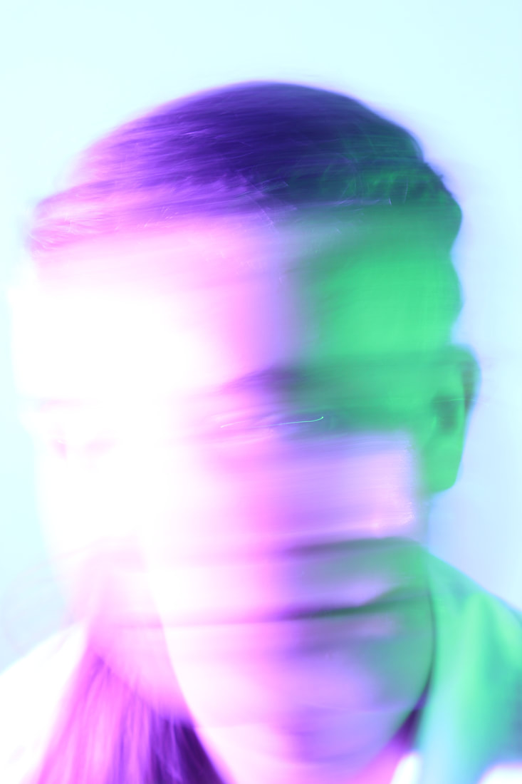
This photo didn't include bokeh - we used a light wand, swayed up and down across the frame, which we had to slow the shutter speed to capture. When editing, I changed the hue, saturation, brightness, contrast and vibrancy. I also changed the exposure and used a filter to change the sharpness around the eyes, and slightly blurred the body, because when cropping I couldn't land the eye on a focal point without cutting out too much of my original image. To me, the orange swipe across the middle looks like the sun ring you sometimes get on a photo, which is why I changed the colours to orange instead of pink.
|
For this photo, I had the lights in the foreground (dangled over the lens) instead of in the background (surrounding the subject). This way all the lights would have a big, transparent look, which looks like an overlay. When cropping, I again found it difficult using the rule of thirds to effectively lead the viewer's eye around the image without cropping too much of the image. I also found it hard to make the lights more saturated than the background without over exposing them - as a solution I selected each light individually to change their hue & saturation. I experimented with levels and colour balance along with the usual adjustments.
|

|

This is the only image where I cropped a lot of the image away. I used the usual exposure, brightness & contrast, hue & saturation, and levels tool, as well as the blur and sharpen filters and brush. I used the blur and sharpen effect so frequently because it added to the soft blur technique that I saw Brandon Woelful in previous research. use For this image in particular, I colourised each of the lights, and used the liquify tool to expand the lights in the background and middle ground, which made the image look a lot more successful. For this image I was bale to lessen the saturation more without effecting the coloured lights.
|
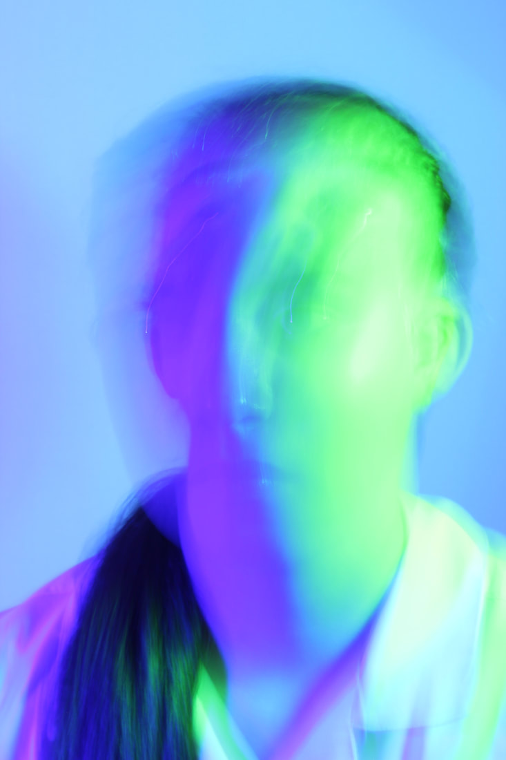
For this image, we dangled from the model's face to the camera, so we had lights in the fore and background. I think because of this, the wires act like leading lines for the viewer. I used the blur and sharpen tool to change the face so only the eye and upper cheek were in focus, so you could see the reflection of the light on the skin (making it look less artificial) and drawing the viewer to the eye as the main focal point. I used most of the colour orientated tools to alter the lights. In this image, I especially tried to highlight the red and yellow lights, because I have found the backgrounds often go a dark blue when I adjust the exposure and contrast, so I wanted a contrasting colour in the foreground.
Side by side comparisons of before and after editing:
|
|

|
|
Experimenting with Light : Bokeh Workshop Best Edited Image
|
Rule of thirds grid:

Original colour palette:

Updated colour palette:

|
This is my final edited image. I chose it because it has a mix of lights in the back, middle and foreground. I like how the wires frame the face, and the shallow depth of field is effective here. In the foreground, the model's face is blurry because of the lights in front of it. As the viewer looks deeper into the image they see the blue light in front of a plain background, and the illuminated eye next to it in clear focus. It seems like the viewer has to travel through the image and then makes eye contact with the model, which is a key focal point because it is the only thing in focus. You would think the eye being the only thing in focus would be the first thing you look at, however I think because of how the lights make the image appear 3 dimensional, the viewer would look at the objects in the front first even if blurred. This was my most successful emulation of Brandon Woelful's work.
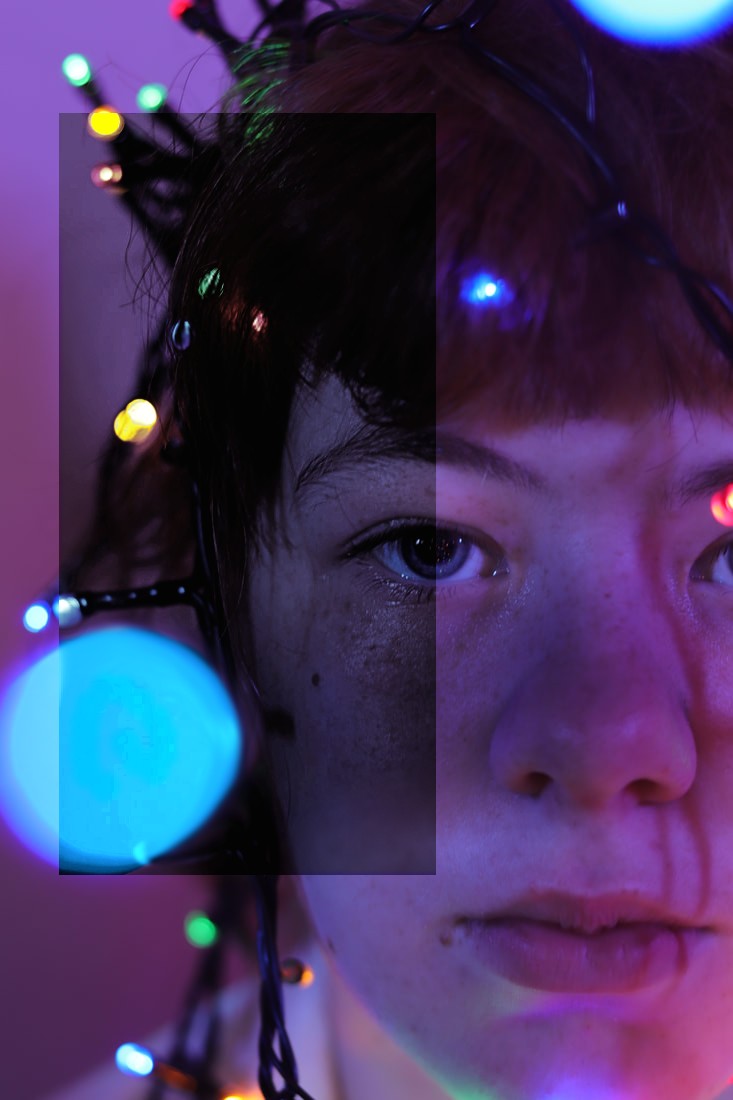
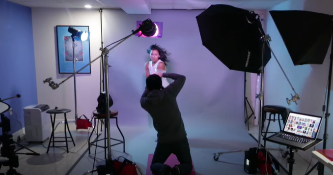
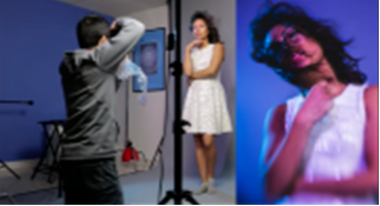
Experimenting with Light: Colour Gels & Motion Blur Workshop
|
Name of technique: Colour Gels/Motion Blur
Colour gels are coloured pieces of cellophane that can be layered. They are also done by RGB lights. Motion blur is all about shutter speed and how t interacts with light. Capturing camera movement blur in shoots add more room for interpretation by the viewer. It also links to our 'Conceal & Reveal' topic. Re-creating this technique: RGB Colour Gels/Motion Blur It helps to have a lens that you can move easily around for extra movement. When including motion blur, slow the shutter speed to about 1/5" to 1/6", or for a longer movement 1"-2". The person in the video shot between f4 and f5.6. Use simple movements like shaking head or moving hands to intentionally blur the image, without it looking messy. The key is to have movement without the face of the subject becoming blurred so it looks messy. You could also use a clear plastic bag or a prism too add a blur to your images when placed in front of the lens. When shooting with cellophane, keep in kind the more powerful the light, the closer the colours will be to white because they will be overpowered. One of the final images from the video:

|
A video explaining how to create a blurred outcome:
Set-up from the shoot:
|


Some snips from the video explaining the process:
|

|
|
Experimenting with Light : Colour Gels & Motion Blur Contact Sheets

|
|
Experimenting with Light: Colour Gels & Motion Blur Workshop 9 Images
|

|

|
Some of the most common tools used in this process:
|
Used the exposure tool to darken image:
Colour Balance so the image flowed nicely together and the gradient looked natural:
|
Brightness & Contrast tool to help separate colours:
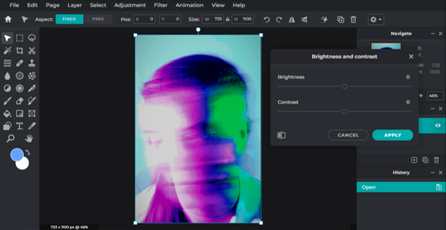
Used the glamour tool to make the picture stand out more from the background:
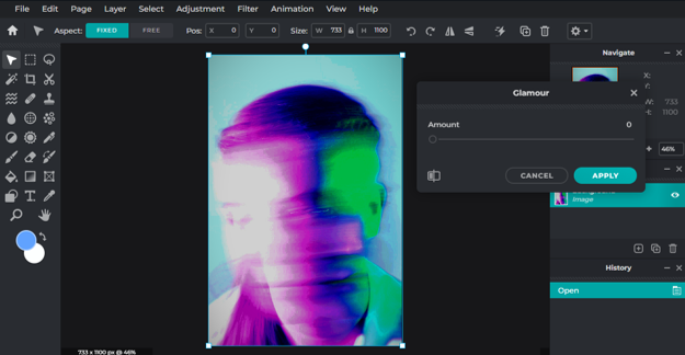
|
Experimenting with Light: Colour Gels & Motion Blur Workshop 4 Edited Images

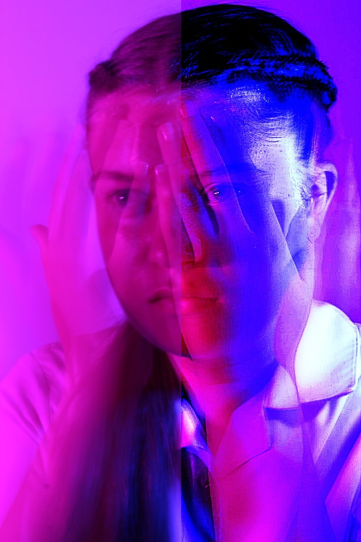
For this edit, we slowed down the shutter speed and slowly had the subject move her hands from in front of her face to behind her head. although you cannot see the hands as much in motion, the shot turned out really successful because of how the hands are transparent in front of the face. This would have been more effective if the subject had been pulling a more emotional expression, but that was my fault because I didn't expect the hands to turn out like this. When editing, I changed the exposure, the highlights & shadows, and used the sharpen tool to add the strange grain effect.

|

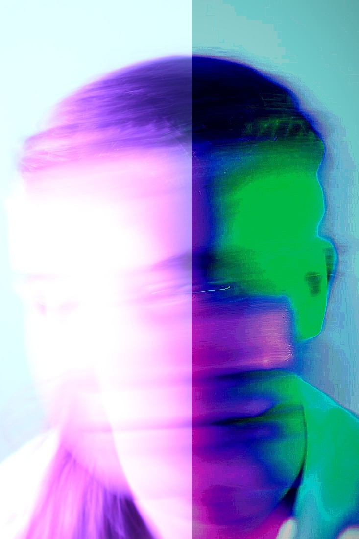
This image was executed perfectly. I had the subject move her head slowly from side to side, then quickly at the end. This image would have been more successful if we had dimmed the lighting, but I like how the colours contrast each other. Before editing, there was a bit too much white so you couldn't see all of the blur, so I adjusted the exposure, the hue & saturation, and I added some extra blur just to embellish. I adjusted the colour balance, and added some filters like bloom and glamour. As an extra, I copied the layer, moved it to the right, and adjusted the opacity. It reminds me of the distort technique studied earlier on.

|
|
This image worked really well because you can see multiple clear faces at once, and there is a slight expression change across the shot which can be interpreted by the viewer. I was unsure what to when editing, so I just worked on deepening the layers of the blur. I used the sharpen tool, the blur tool, and the hue, saturation, vibrancy, levels, and contrast tools. Next time I would add varied facial expressions and contrasting colours,
|
For this image we didn't do any motion blur whilst shooting, so we had to quicken the shutter speed. I decided to add some blur in to the eyes whilst editing, because I thought it would leave some room for interpretation by the viewer. Next time I would probably blur the mouth as well to add mystery. and I made some simple adjustments like vibrancy, exposure, highlights & shadows and saturation. I also added a vignette just as an extra.
|
Side by side comparisons of before and after editing:
|
|
|
|
Experimenting with Light: Colour Gels & Motion Blur Workshop Best Edited Image

|
Rule of thirds grid:

Original colour palette:
Updated colour palette:

|
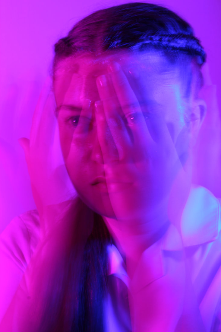
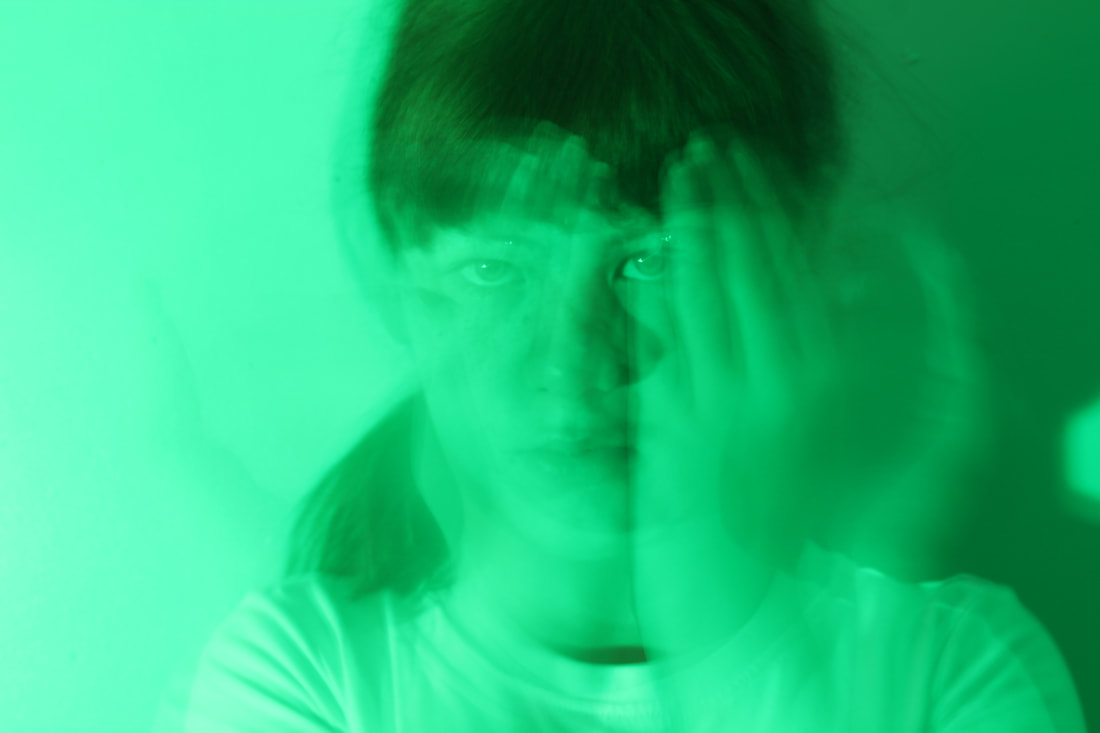
I chose this as my final image because it links the most to our topic. The hands are concealing the face, but the expressing is still being revealed by the movement of the hands. The photo can be interpreted different ways. For example, you could say the model is displaying manipulative behaviour by pretending to be upset, when really there are displaying different emotions. You could also say the model is presented as naïve and unknowing by the hands being shown over the face, but because they are translucent you can see the truth in the eyes of the model. The facial features line up with focal points. When editing, I liked how my adjustments made the colouring on the right side of the face made it look like a metallic paint, and I think the image as a whole looks a it like a painting, which reminds me of Emma-Leone Palmer's work. I would say this image is a crossover between her and Lindsay Adler's work. This effect added to the glitchy, weird atmosphere with the moving hands. If I were to recreate this shot, I would try and gain more emphasis on the hands as they move away from the face, because the other hands aren't particularly visible.
Home shoot: Colour Gels and Motion Blur Workshop 6 Best Images

|

|

|
Home shoot: Colour Gels and Motion Blur Workshop 3 Edited Images

|

|

|
Home shoot: Colour Gels and Motion Blur Workshop Best Edited Image

|
A strength of this shoot is that we were able to capture a variation of motion blurs. A limitation was that we only had access to one colour that could not be changed (green). There as also a lot of shadow in the background of this shoot, but that was hard to avoid. If I did this again I would add more lights and more colours. This image was the most successful because the motion blur didn't disrupt the focus on the eyes behind. When editing, I copied the layer and turned it a desaturated blue, and then used it as an overlay to represent multiple emotions (sad for blue happy for yellow). The idea was that the hands are concealing the true emotions of the model so they appear to be joyful.
|
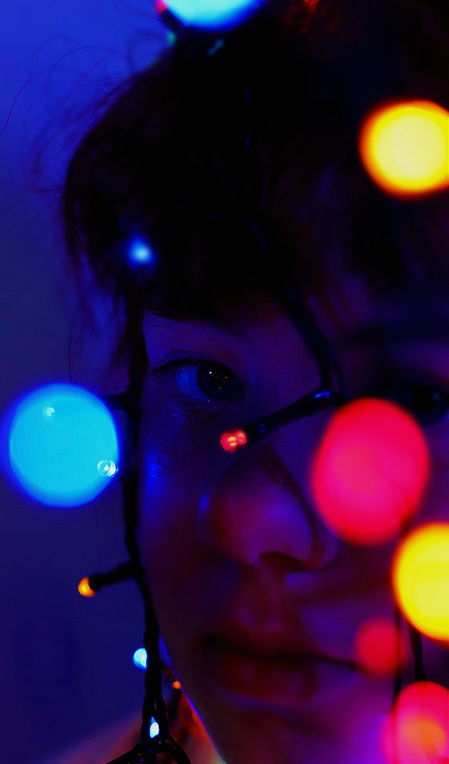
Experimenting with Light: Colour Gels & Tube Lights
|
A video explaining how to create an RGB outcome:

Set-up from the shoot:

|
Name of technique: RGB Colour Gels/Motion Blur
Colour gels are thin pieces of coloured cellophane placed over a light source to project coloured light. RGB lighting allows the photographer to customise the colour of the light without using cellophane, which unlocks many possibilities. Using tube lights in photography can be seen as a form of light drawing. Re-creating this technique: RGB Colour Gels To emulate this shoot, you will need a large RGB light. By adjusting the height and distance of the light, you can erase shadows from the face and background. When using two colours, find your chosen colour on the colour wheel and choose the colour opposite it, because these are the most complementary. If you want, add a 3rd light to cut the subject away from the background. An example of three colours to use would be blue, yellow and dark green. The shutter speed should be about 1/60, ISO 200, and aperture f2.8-8. Drape the tube lights around the subject in any pattern, and make sure to change the colour to something different to the other colours. One of the final images from the video:

|
Below are some snips showing the process for the shoot. The photographer said that he adjusted the exposure when editing:

|

|
|
Experimenting with Light: Colour Gels & Tube Lights Contact Sheets

|

|
Experimenting with Light: Colour Gels & Tube Lights 9 Images
|
|
|
Some of the most common tools used in this process:
|
Cropped the image to remove unwanted background and control focal points:
Highlights & Shadows to add dimension:
|
Brightness & Contrast tool so you can see the finer details and to eliminate the overexposure:
Liquify (to expand lights):
|
Experimenting with Light: Colour Gels & Tube Lights Workshop 4 Edited Images

|

|
|
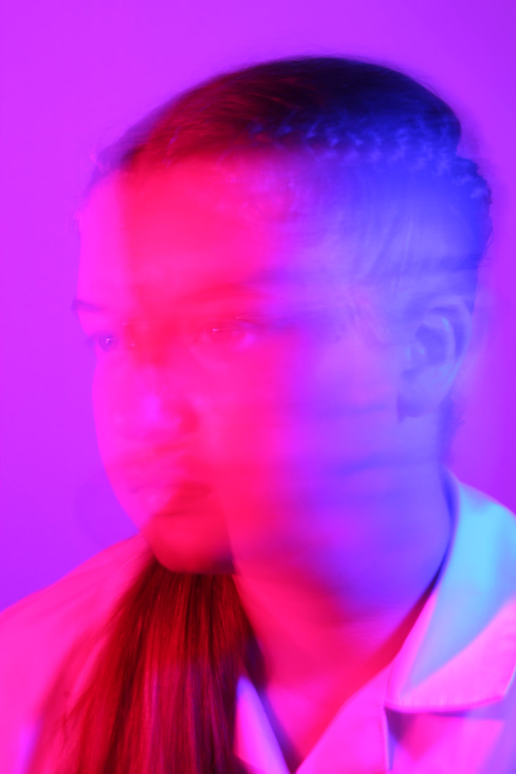
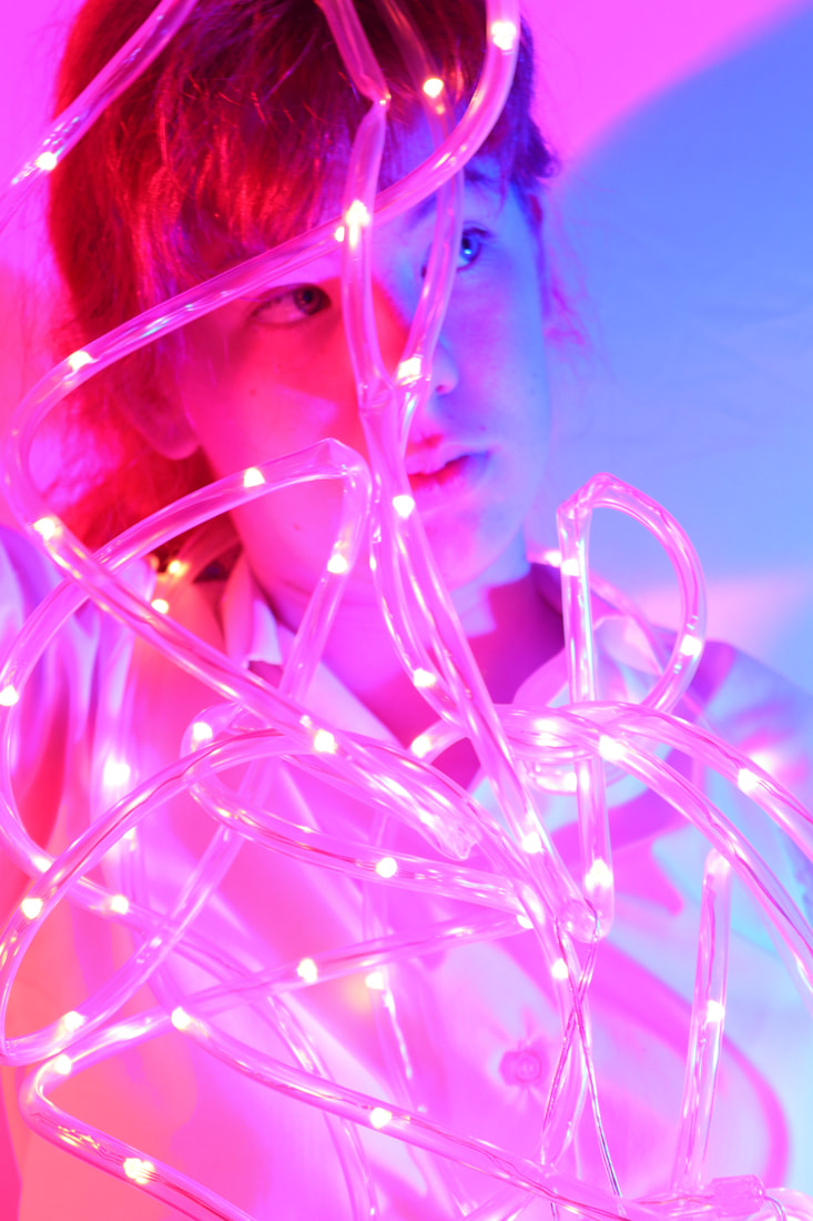
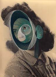
This image reminds me a lot of Emma-Leone Palmer's work. We experimented wrapping the tube lights around various limbs. If I were to reshoot this image, I would add some lights in the background, or lessen the amount in the midground, because I think they are taking the attention away from the model. I would also practice focusing the camera on the model more. When editing, I selected parts if the background and increased their vibrancy and the contrast. Next time I would add some more contrasting colours to this image.

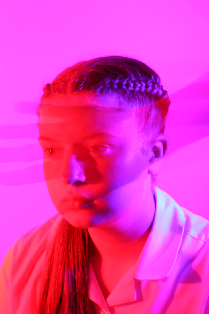
I loved the composition of this shot, it had a mix of lights in the back, mid and foreground. The colours weren't overpowered by the lights. The eyes are the main focal point in this image, and the wires act as leading lines. When editing, I used the sharpen brush to carefully go along the tube lights, sharpened the eyes, and blurred out a circular border around the image and the model's body that wasn't included in the central loop. I used the adjustment tools and tweaked the background to add vibrancy.
|
For this image, we tried to wrap the tube lights around the model and then drape them off the camera. I like how there aren't any lights in the background, so the viewer can pay more attention to the colour gels in the background. When taking the photo, I unintentionally blurred the tube lights, but I managed to fox this mistake in editing by blurring the lights more in the foreground, so you can't tell the mistake as much. I also think this technique had a 3 dimensional effect on the image, The tube lights act as leading lines as you look into the image.

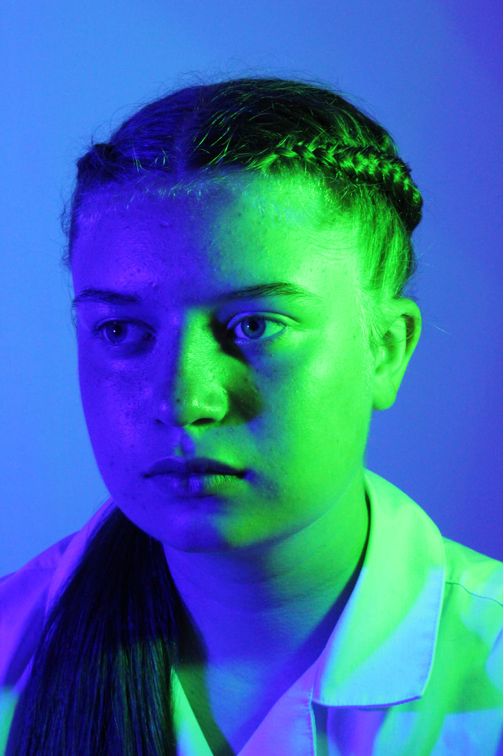
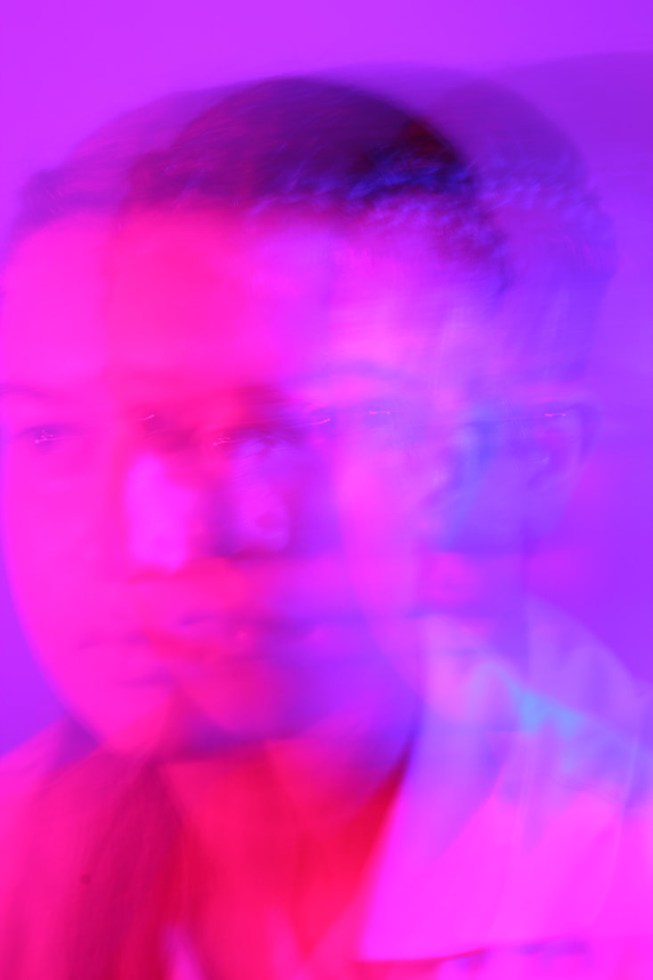
We used less lights in this image, but I think it was still successful. I lowered the exposure, darkened the shadows, and then went in and brightened the lights individually, expanded them, and made the split of colours down the middle of the face sharper. I added more details and highlights to the face, and cropped the photo down. This reminded me of Lindsey Adler's work. Next time I will adjust the lighting strength and colour. I will link more to the 'Conceal & Reveal' topic in the future.
|
Experimenting with Light: Colour Gels & Tube Lights Workshop Best Edited Image

This is the final image chosen from this shoot. I liked how the tube lights were placed, and the composition was very successful. You can see the blur in the background lights, and the clear lights in the front (shallow depth of field). If I were to do this shoot again, I would perhaps change the colours to some contrasting colours. I would also strengthen the lights, because I found myself having to edit the lights in editing because they looked washed out. I will try and become more comfortable using manual and auto focus, so I don't need to edit as much.
|
Rule of thirds grid and leading lines:

Original colour palette:

Updated colour palette:

|
Artist Investigation / Laura Williams


|
Why did I choose this artist?
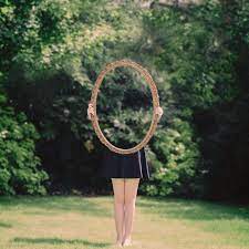
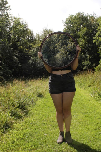
Laura Williams is a photographer who specialises in "fine art portraits and natural, creative style wedding photography". She creates abnormal portraits: a person being cloned over and over in the same scene; the subject being pasted onto an unusual background; or the size of the subject or objects around them being changed to look unusual. I will be focusing on her work when she takes mirrors, and creates an optical illusion. I have chosen this artist because she links with the remove technique in our topic. Her mirror images link heavily with the identity theme in this project, because the removed part of the subject could be interpreted that they are missing a part of their identity, or perhaps they feel worthless or invisible. I also want to experiment with this new technique, because the editing process appears complex and I want to experiment with tools. Technical Processes: Laura Williams explains how to create her unique illusion in an interview, saying she too a photo of an empty background, and then without moving the camera, took another photo of someone sat holding a mirror over part of their body. She then masked the first image over the second, so that the background was in the frame and filled in the gap, giving the appearance the model was invisible. She gives no information on specialised camera settings, and I assume they were standard settings for any normal photograph, however she mentions she uses a 50mm 1.8 lens. Emulation: To emulate her work, I will follow the brief instructions she gave for editing, and experiment holding the mirror in different places. I will use normal camera settings (not deliberately changing the lighting from normal). |
Here is an about page on Laura Williams
"Photography is magic, it allows us to freeze moments that would otherwise be lost. We get to keep those precious moments safe and can relive them again and again" "Photography is quite simply a medium in which you can tell a story in a visual manner" |
Emulations / Laura Williams
|
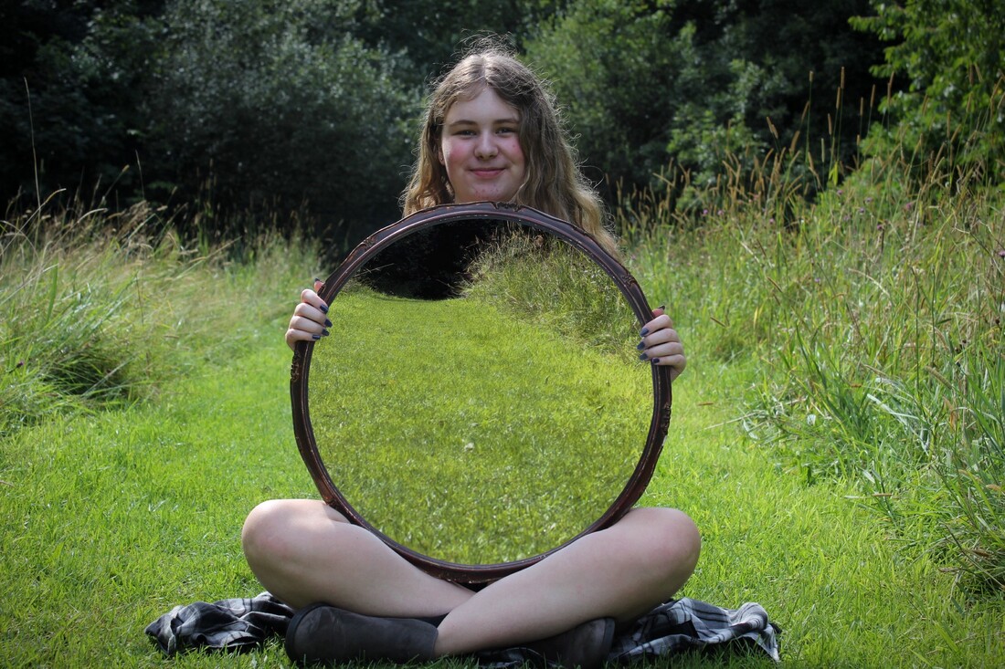
When working on these images, I used grass, took a photo without the model in and then with the model in just like Laura Williams described. When editing, I cut my subject away from the background and cut out the centre of the mirror. I then put this layer on top of my plain background to create the same illusion. Editing was a strength, because after already having taken and edited some other emulations, I found to be fairly easy. A limitation for me was certainly matching up the layers, the plain image was overexposed and I had to adjust the colour, shadows and brightness to blend the two. I also found it hard to carry on the shallow depth of field I had in the first image. If I were to do this again, I would limit camera movement between shots and improve adapting camera settings to lighting changes.
|
|
Editing process:
|
Lasoo tool to select the inside of the mirror (more specifically the polygon version of the tool:

Layering the plain background onto the image and matching it up:

Emulation:
|
Deleting the inside of the mirror to make room for the background layer:

Exposure, blur, vignette, brightness & contrast, saturation so it doesn't look so obviously edited:

Original photo:
|

|

|
After my main emulation , I took a few more of Laura Williams' pictures and decided to emulate them.
Recreations of her work:

|

|
For this image, I took many photos of my subject in different positions without moving the camera (which proved to be very difficult), and then cut each one out individually and placed them on one photo, adjusting lighting if necessary.

|

|
For this image I made the grass too deep and so I had to cut some grass out which unfortunately made the image look choppy. I took two pictures of the subject simply moving arm positions, and rotated one vertically ad horizontally, and selected and flipped the shadow to match the direction of the sun. I deleted the sky off both images because it was covered in trees, and used a stock image that roughly blended into both layers. If I were to do this again I would add more texture to the horizon grass.
Images inspired by her work:
|
|
Some editing snips from one of my emulations:
|
Selecting (lasoo tool) model:
Placing all layers on top of each other and fixing:
|
Deleting background layer to all photos but one:
Flattening layers and making adjustments:

|
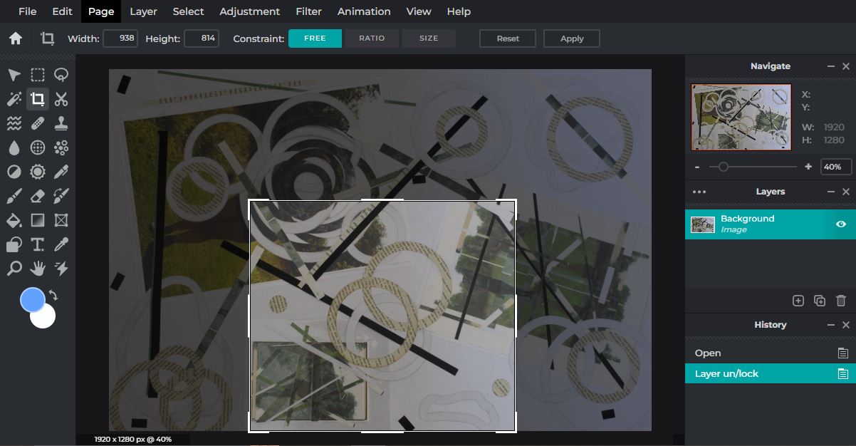
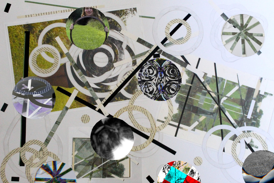
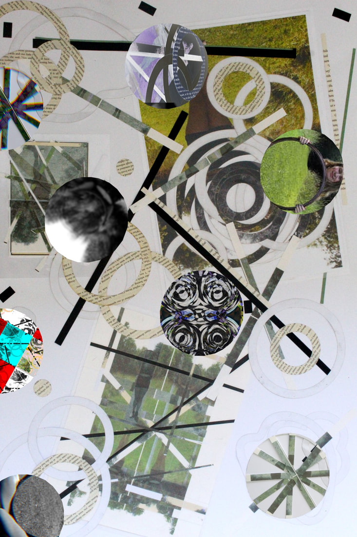
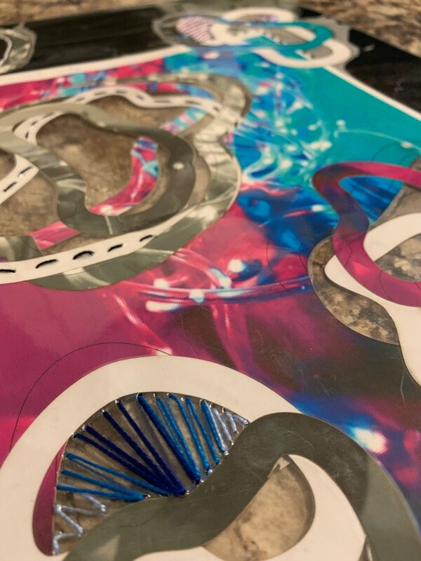
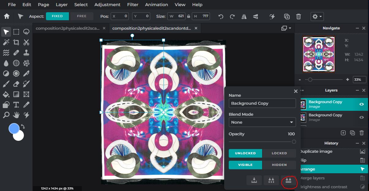
Physical Composition Design 1
|
What is the aim of this Physical Composition?
At this point in the project, I am going to further develop some images I have already taken using my physical editing skills. For me, I am capturing a moment in time, and fragmenting it to erase, distort, and subvert the identity of the subject, to add another layer of confusion to the interpretation of whoever sees it. My original images are from my mirror work, where I used editing adjustments to cut out the centre of a mirror to create a puzzling feeling for the viewer. I also did this to feel like a part of the subject's identity had been removed, because I am keeping up with the 'Conceal & Reveal' theme in the project, and this is an idea I'll be further developing during the physical editing process. I want to experiment cutting into my images, and combining monochromatic and colourful layers to show perhaps dark aspects of the subject's personality they may wish to conceal, or blank them out completely by using white paper. |
Portraiture: 
|
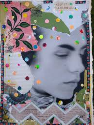
Inspirational images for my physical editing technique (collaging):

|

|
|

|
|
What physical photographer(s)/techniques are furthering your ideas for Physical Composition 1?
For my work I have been inspired by Laura Williams, who uses digital editing to remove areas of the image to create confusion for the viewer. I will be adding onto this physically by removing parts of the photo and moving them about. I will be focusing on space and colour, because I am using a mix of colour and monochromatic. I will be removing, moving, and remaking my photos by collaging. |


Physical editing plan:
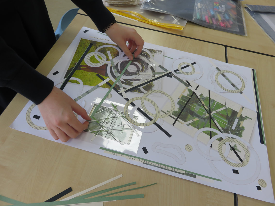
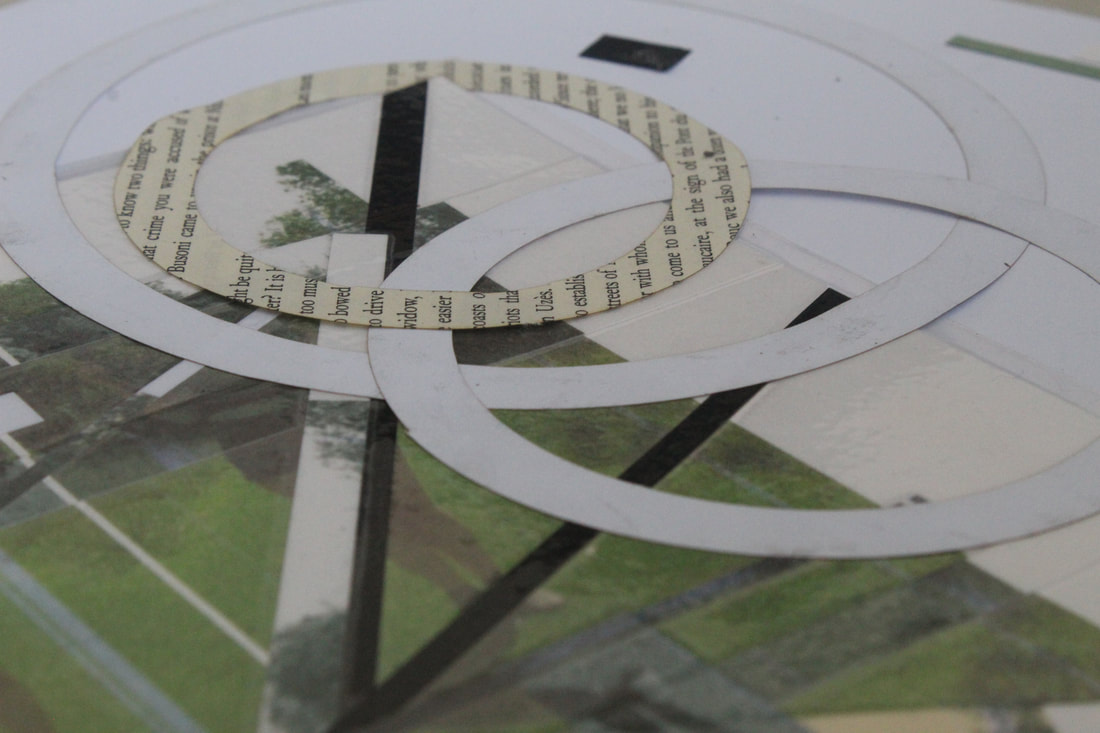
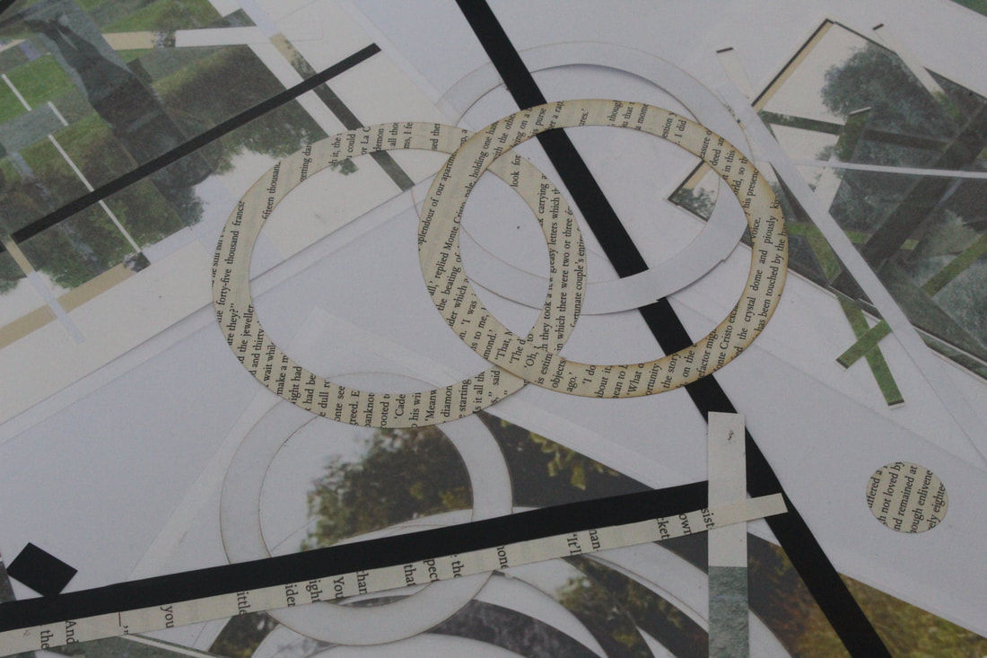
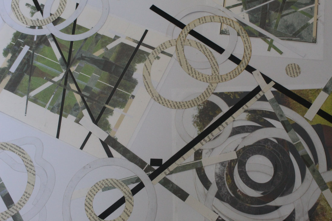
As a next step, I am going to use 2D design and a laser cutter to cut circles into my work, in colour, monochrome, and black and white circles. I am also going to cut into some book pages, and cut out strips of the same colours. I will layer and collage the strips and circles onto my image on a large and smaller scale, and then combine my smaller outcomes into one big composition on a large mountboard.
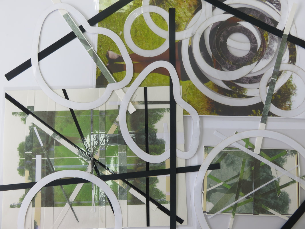
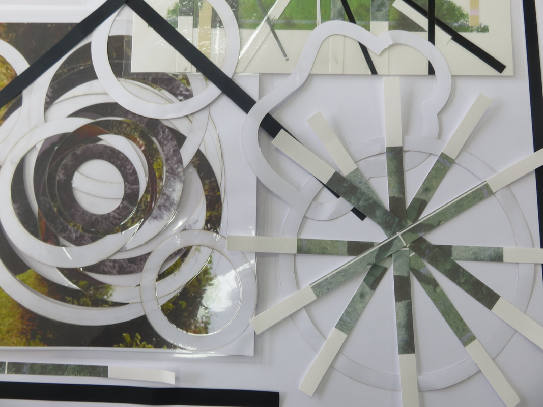
Physical editing process:

|

|

|
|
|
|
1: To start, I found one of my images from my Laura Williams shoot, and put it in the problem 2D Design, where I used the circle tool to draw circles at random points, and then used the contour tool to replicate that circle 10mm apart. I then printed out the image in colour, black and white, and in monochrome.
2: Then, I took the first image, rotated it on A4 paper and changed the colours slightly. I printed out this paper a few times, and then sliced into it with strips, and collaged it back onto the original rotation, messing up the colours and position to give a distortion. I did the same thing on just one small picture.
3: Finally, I took all three small projects and chopped some strips of black, green and white paper, some leftover small versions of my image and reused the book paper and white circles. I experimented laying them out in different ways, and then stuck down all my strips.
Outcomes of physical editing:
|
|
|
Successes and setbacks at this point:
Something that went very well during physical editing was my large edit where I placed circles all over the picture. I like it because it followed by distortion theme, and it looked effective. I made the decision to start using strips and smaller versions of my image because my work seemed a little basic and I wanted to keep advancing because the image has a lot of potential. Something that went wrong during this process was my second large picture, which I unfortunately have no image of. Originally I had cut out circles expanding from the circular mirror featured in the photo, which were twisted instead of moved because I wanted something different but still confusing for whoever sees it, like an optical illusion. However, I took this too far by deciding to cut a spiral into my work, which resulted in unnecessary complications which ultimately made me decide to scrap that aspect of my work, but it looked really good as a 3D model. However this was perhaps a good thing, because having that cap in my physical composition gave me the idea of using the smaller images and working on the mountboard, which I think looks better now because there was more room for development. To me, this piece of work looks like an unsolved puzzle.
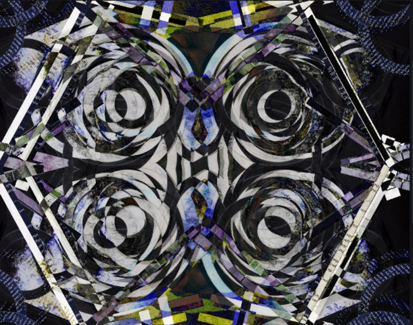
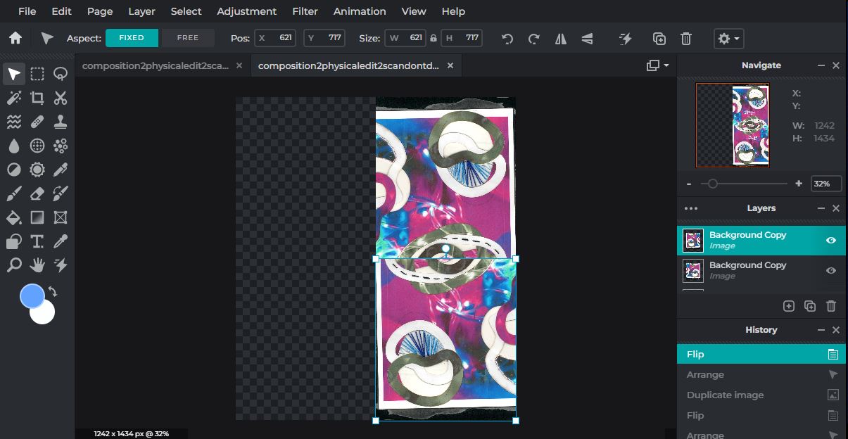
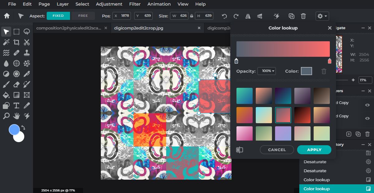
Edited Images Digital enhancing:

|

|
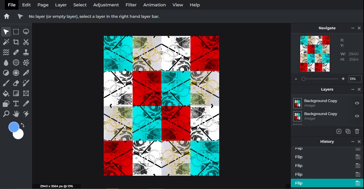
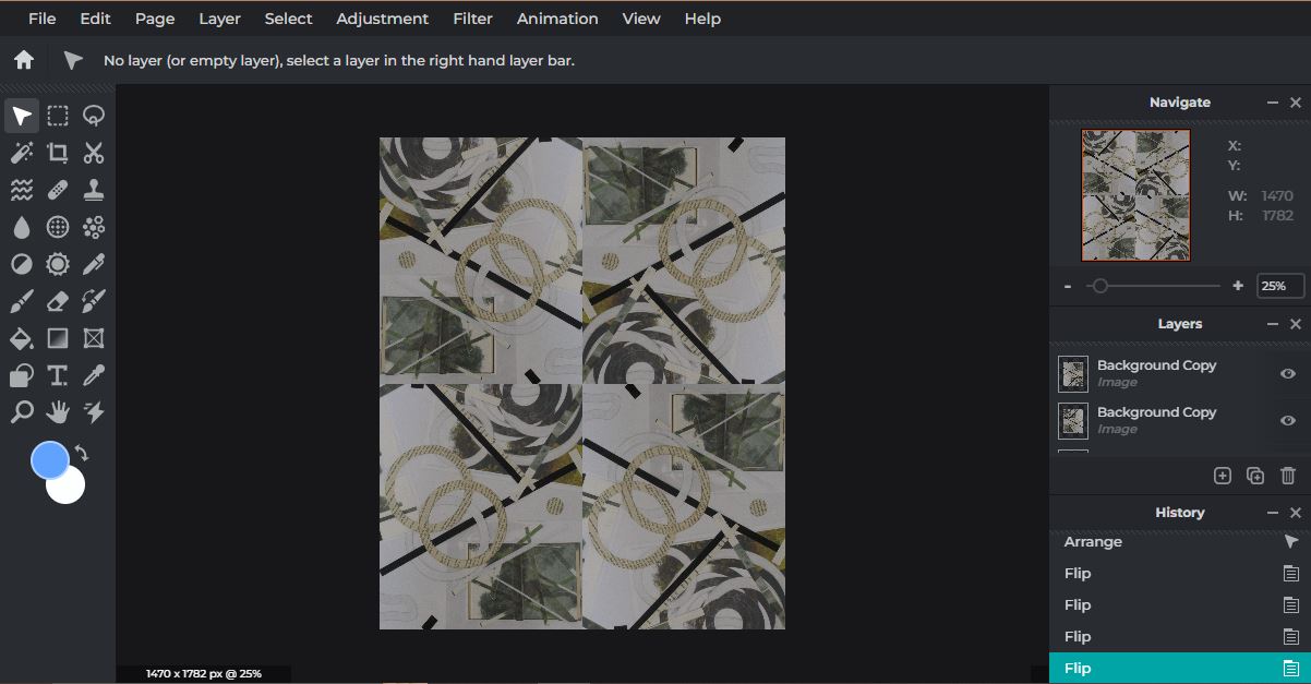
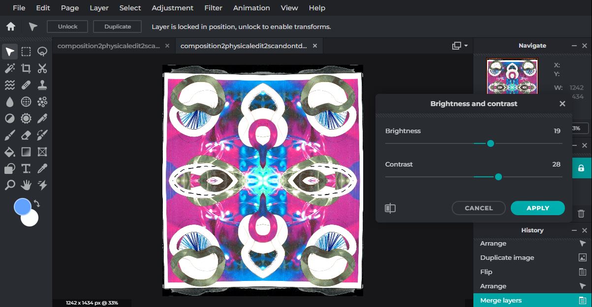
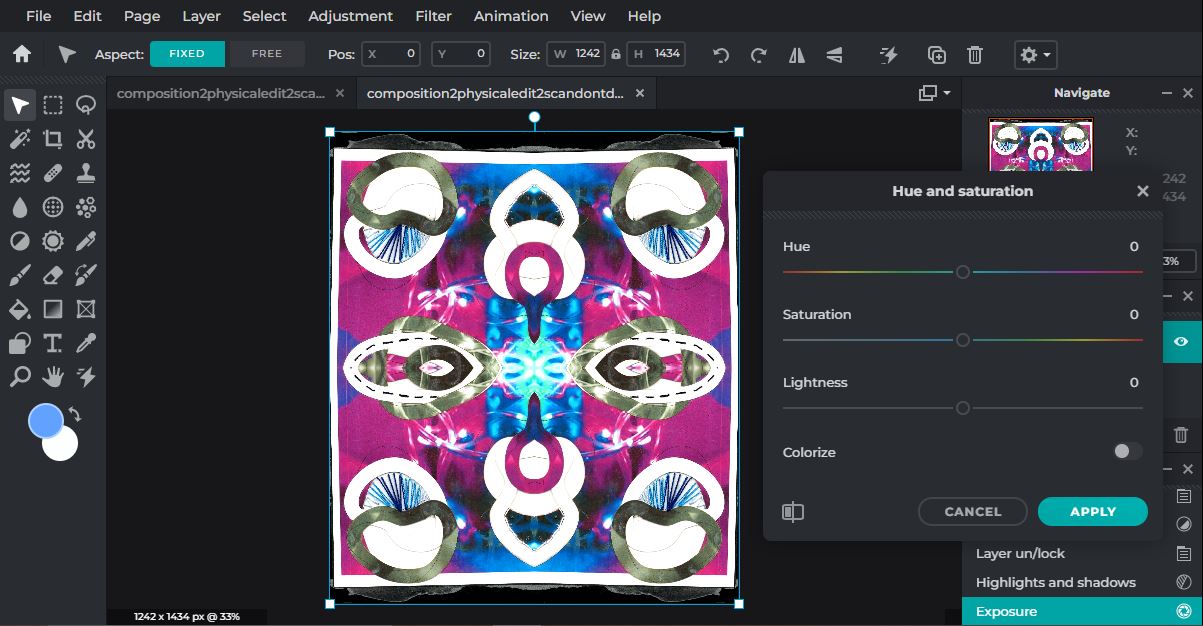
For this edit I cropped down the image, changed some of the colours and rotated it. To do this I doubled the page size in length and width, moved my image to a corner, duplicated it and rotated horizontally, and another vertically until I filled the canvas. We did the same thing back in our Dennis Wojtkiewicz work in the Abstract Nature project, so it was useful to already have the skills for this edit.
|

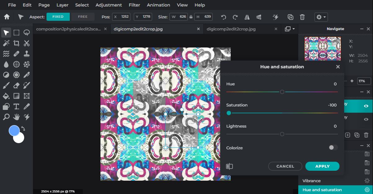
|
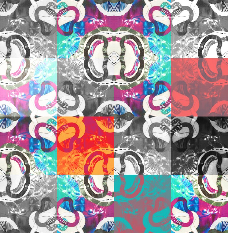
So for this edit I cropped the physical edit down a lot to get a bit of everything, and then I rotated it using the same method as the last edit. This time however I didn't make it symmetrical, so I flipped the duplicates around vertically and horizontally to make a strange frame. Then I edited each of the small images (some changing the colours, another making it monochrome and so on), and then I flattened the layers and rotated again, flipped and made this peculiar chess board looking edit. I like how it's not symmetrical because the theme of thus composition is everything is puzzling to look at.

|


|
So for this edit the idea was to combine everything from this composition into once. I included my initial images from my shoot, my experimenting images when I was deciding a layout, my angled shots from my final physical edit, and my final physical edit as the mainframe. I used the wand tool to highlight around a circle already in the photo and then I removed it and cut out various holes around the original image. then I used other images to fill in the holes. As the images got less similar to the background image I glitched them more with the glitch too, inverted them, blurred them and changed the saturation. I also brightened the original image with the brightness and contrast tool.
Final Edits:

|
Final Outcome:
|
|
This is my final outcome for composition 1. I would say physical editing is my weaker area, because I find it hard to come up with creative ideas and I find myself less willing to experiment when there's no undo button. However, I do like how it turned out, and how I overcame the problems I was met with. Originally I never planned to add in straight paper strips, but I think if I am trying to show someone's identity, personality or thought processes, there are definitely different aspects and shapes that make up a person. I think in future I will try to not work as much with paper, because I have done that here and in the last project. I really like the way the digital edit turned out, because the image shows the process, and when you look around you can see the steps taken to get to this point. I would say the lines and circles here show the straight forward areas of this process and the more complicated too. The but I enjoyed the most about this composition was seeing how you can start with a simple photo and just keep developing in different ways and come out with something different each time. If we are going to really talk about the interlacing of the project through this piece you could say that in this final piece I am revealing all the steps, successes and failures, even though most of the time if something goes wrong in a project you could want to hide it.
|
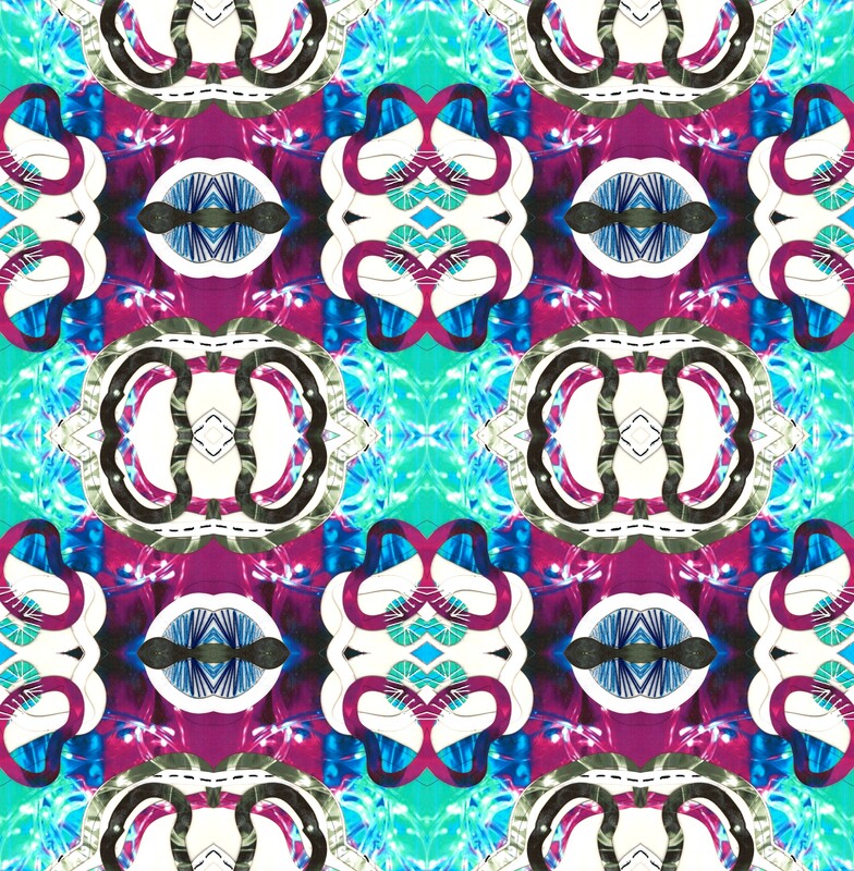
Initial image:
|
Physical edit:

|
Digital edit:
|
Physical Composition Design 2
|
What is the aim of this Physical Composition?
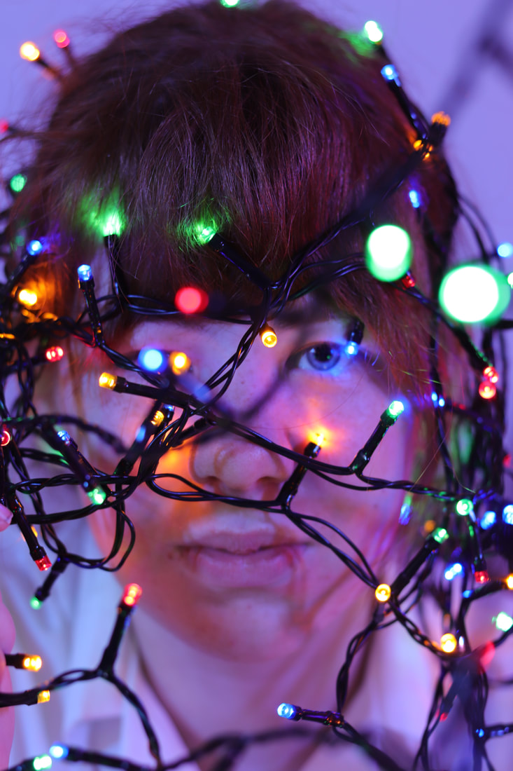
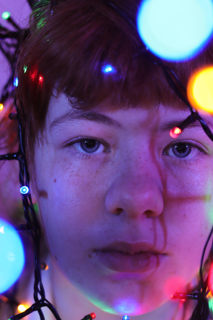
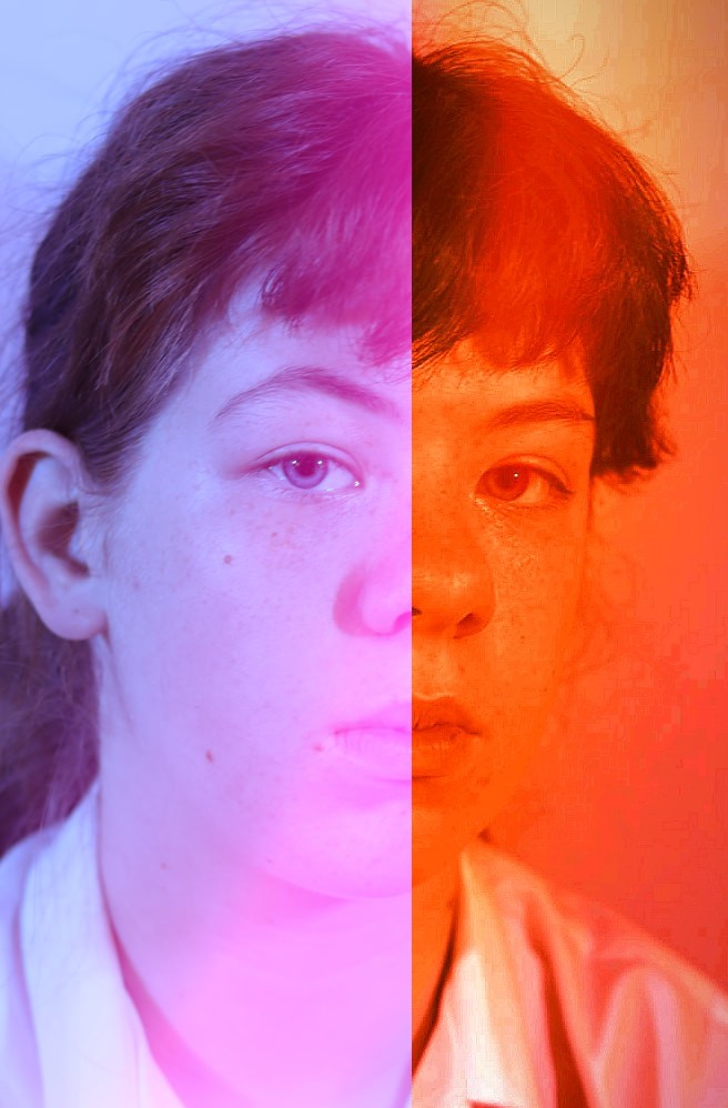
For this composition I am really going to be focusing on the identity of the subject. In the last composition I was building on a feeling of confusion, and if I was showing a person's identity I had it spread out and revealing everything (which is why I incorporated the whole process into the final image). However for this time I want to develop the idea of someone hiding their true identity from the person seeing. The initial image I am working with already shows that, because you can only clearly see the eyes and you can see the subject holding the cover of wire over their face, and not having an explicit emotion makes the person seeing this image search around the photo (like the colour of the lights) to find an interpretation of the subject's thoughts or feelings. On the other hand the picture on the right has the lights positioned to frame the face, and the fact that the lights (leading lines) are starting in the foreground and going to the back shows the person wants to be seen. |
Identity:
|


I chose this quote because I am actually going to be doing the opposite in this editing process (concealing instead of revealing)
Inspirational images for my chosen technique (sewing):
|

|

|
|
|
A video about how to embroider on a photo:
|
A gallery website feauturing Maurizio Anzeri:

|
What physical photographer(s)/techniques are furthering your ideas for Physical Composition 1?
For my physical editing work I have been inspired by artist Maurizio Anzeri, who sews with colour onto black and white or sepia. He works in a variety of media including sculpture, photography, drawing and traditional craft techniques. Although I probably won't use as much thread as he does, I am going to sew over my image to enhance it, and combine the sewing technique with the collaging technique from my last composition. I think layering different edits will help me reinforce the barriers the person is leaving to protect their identity form being explicit. In terms of elements of photography, I will be focusing on colour, line and space. |
Physical editing plan:
I am going to start by using 2D Design to again cut out some shapes from my image, and then print these off in monochrome, colour, and on black and white paper. I will make my shapes more abstract this time. then I will layer the colour image onto a black sheet of paper to create extra room. Then I will collage together all my shapes over the black paper and my image and laminate my work. Then, I will sew onto my work with colours matching the original colours from my image, and black/white.
I am going to start by using 2D Design to again cut out some shapes from my image, and then print these off in monochrome, colour, and on black and white paper. I will make my shapes more abstract this time. then I will layer the colour image onto a black sheet of paper to create extra room. Then I will collage together all my shapes over the black paper and my image and laminate my work. Then, I will sew onto my work with colours matching the original colours from my image, and black/white.
Physical Editing process:

|

|
1: After printing off my images and various shapes I collaged the paper onto the image, layering up the pieces so the overlapped and expanded across the the black paper, because to me it looked like breaking the 4th wall. I used white a lot because it is a dominating colour and adds to the blanking and covering identity theme. I tried to place the blue cut outs over the pink areas and vice versa to add some contrast
2: When sewing, I did some lines where I just sewed along the shapes that overlapped others to add dimension, however I also sewed across some of the clear gaps in a gradient of shades of a colour, because I wanted it to look like the person was maybe trying to stitch back their personality, or perhaps their true identity is just hanging by a thread. I didn't edit near the eyes because I still wanted them to be visible, but not as striking as they were before to reinforce my idea
2: When sewing, I did some lines where I just sewed along the shapes that overlapped others to add dimension, however I also sewed across some of the clear gaps in a gradient of shades of a colour, because I wanted it to look like the person was maybe trying to stitch back their personality, or perhaps their true identity is just hanging by a thread. I didn't edit near the eyes because I still wanted them to be visible, but not as striking as they were before to reinforce my idea
Outcomes of physical editing:

|

|
|
Successes and setbacks at this point:
At this point in the process, I am really happy with how my physical edit came out. I think the sewing was the most successful part of the edit, because it added back the colour that had been taken away. I like how many different ways of editing have been combined, from having clear spaces to black spaces to white spaces, and how the eye has to search for the subject now. In the original image the tube lights acted as a cover rather than a path to the model, so it was successful to build on that. it was also good to work with something other than appear, because I expressed in the evaluation last composition I wanted to expand my skills. I would say my main limitation was the sewing, because although it was effective in the end it took a very long time to do and there were a few instances where I had to take it out because it didn't look right. If I were to do this technique again in an exam, I would need to work on my timing, hut that should be easier now I have the experience.
Edited Images Digital enhancing
I was contemplating developing my work further digitally, because in the last composition there was room to keep going and expanding to convey the intention I was going for, however in this composition I thought that had been achieved. I decided to experiment a little in Pixlre, and to my surprise I was able to improve this piece.
I was contemplating developing my work further digitally, because in the last composition there was room to keep going and expanding to convey the intention I was going for, however in this composition I thought that had been achieved. I decided to experiment a little in Pixlre, and to my surprise I was able to improve this piece.
Editing screenshots:
|

|
First I actually cropped the original image down so it included some of the image, edit and the border. I made sure to keep the eye in because otherwise it would be hard to tell what the subject is. The I rotated the image 4 time by doubling the length and width of the page and duplicating/rotating the image. Then I flattened the layers together, and adjusted the exposure, brightness & contrast, and the hue & saturation to deepen the colours and fix the overexposure. I wanted to keep the black border and the main bits of sewing because I didn't want to stray far from the physical version for this edit.
|
|
|

|
For this edit I cropped down the original image again and rotated it. I then doubled the page size again but instead of moving the rotation to the side I kept it in the middle and built around it. It kind of has a checked pattern now which I like. Then I adjusted the shadows, highlights and exposure. I think this edit looks well put together, and I like how you can see the contrasting colours I tried to enhance by sewing, but digitally editing let me make them more vibrant against each other. In this edit you would not know what the original subject or image was, so it kind of creates a new interpretation for the viewer.
|

|
For this edit I took my last edit, flipped all the squares horizontally and vertically to make a new pattern, and then made all of the squares different by desaturating, overexposing, using the colour balance tool and changing the hue. This was just an experiment to stray away from the standard rotational symmetry, where everything looks the same.
Final Edits
|

|
|
The middle edit is my favourite digital edit, even though it was my simplest edit. I chose it because you can still see the person, and the intent I discussed at the beginning can still be recognised, and you can still see the physical editing clearly.
Developing further and final outcomes:
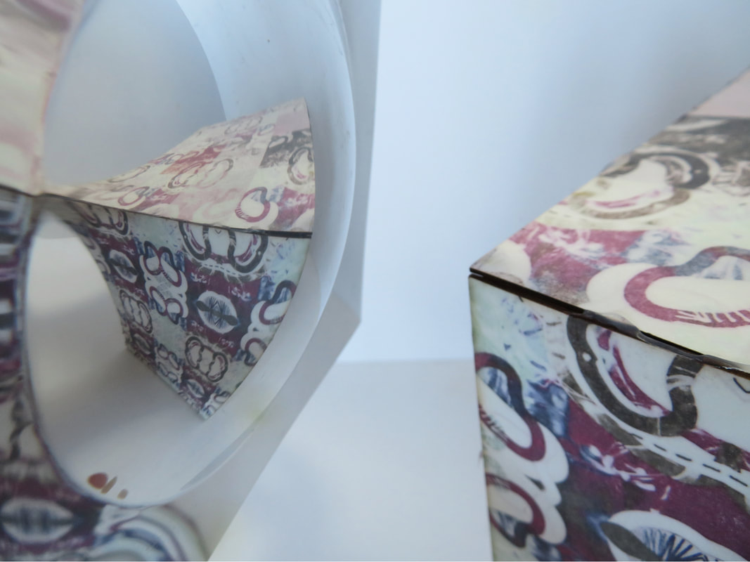
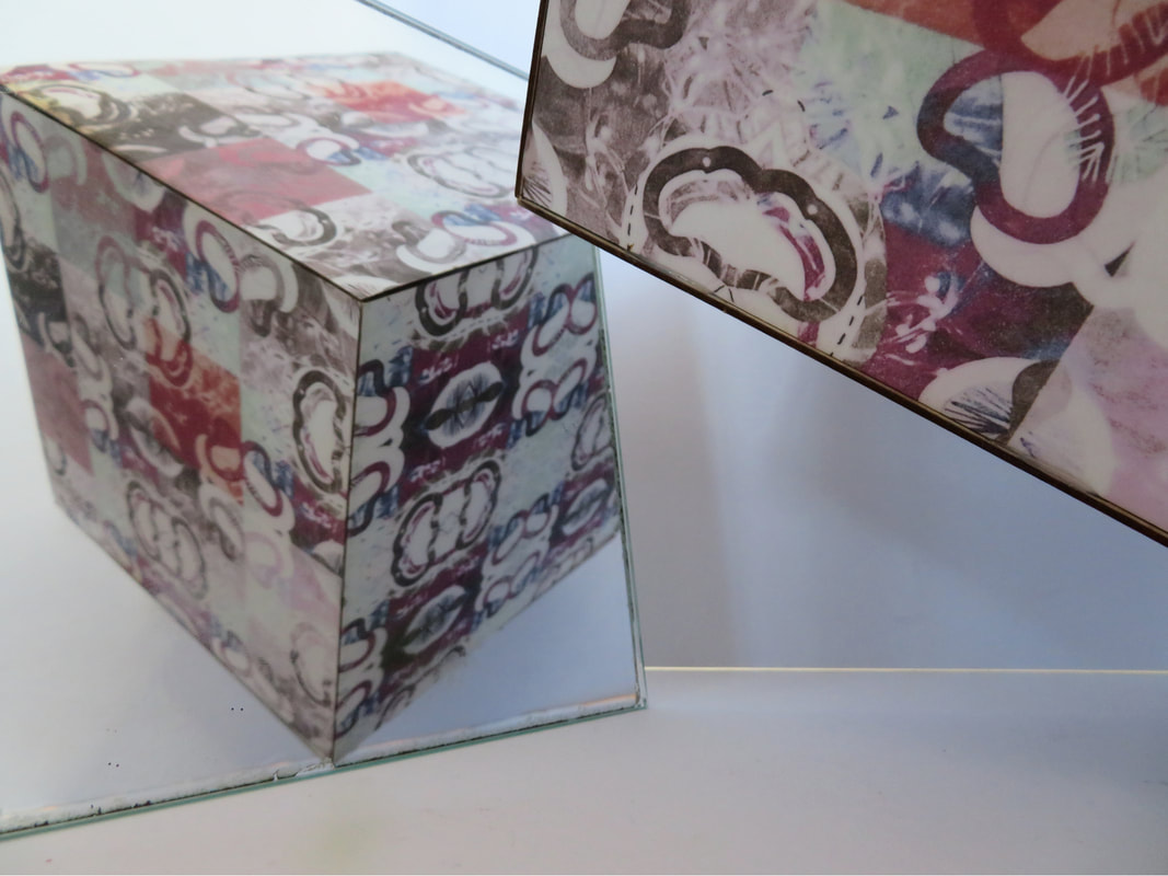
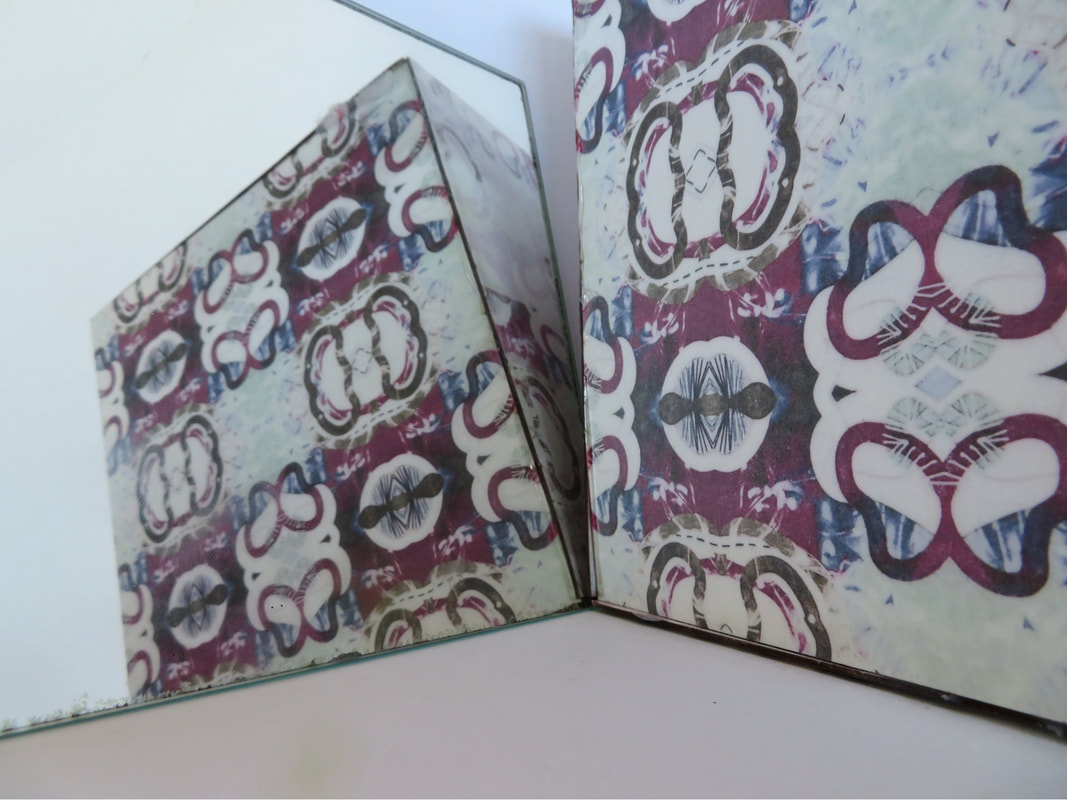
As a final development to this composition, I took the digital edits from my physical one and sublimated them onto six thick mountboard squares, and stuck them together with hot glue to make a cube. I'm not sure how to interpret this creation in terms of the message of identity it gives off, but I would say that flipping the cube and seeing the different edits shows how there are multiple opinions and perspectives to anything we see, whether that be person (original subject) or a piece of art. I really liked the use of a mirror when shooting the cube, because you could show the cube from one side, then use the mirror to show a different design. Using the rounded mirror created an interesting warped effect as well. A strength of this composition was that I had a clear plan from the start, and there were no major setbacks like in the last composition, but I was able to add onto my plan and develop further like with physically editing my extra digital edits. A weakness in this composition and the edits could be that when the physical edit is scanned in, you can't see the clear areas, which now look white (the area in the grey shape), though I think editing digitally helped this because t was a distraction. If I were to work with this image again from the start I would perhaps experiment with a lightbox, and employ cellophane, acetate or coloured light.
|
|
|
|
Initial image:
Digital edit:

|
Physical edit:

Final outcome/physical edit pt2:

|
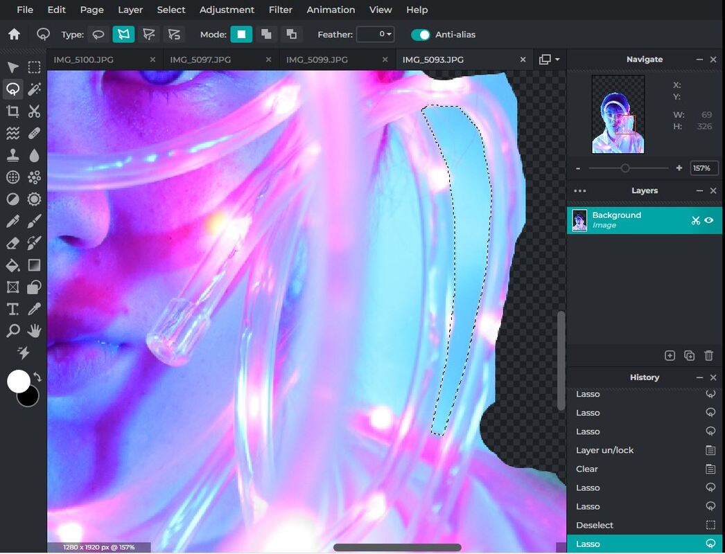
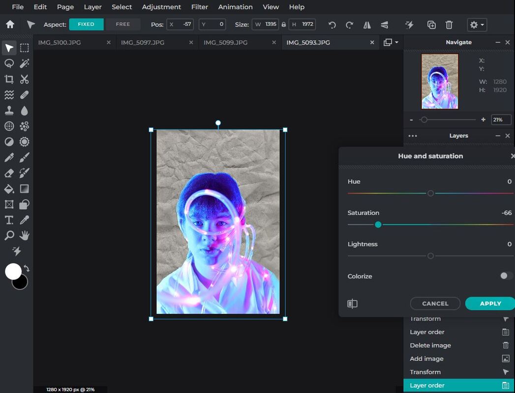
Digital Composition / Mock Exam Plan - Liverpool Shoot:
What is the aim of this digital composition?
For the digital compositions I will be furthering outcomes from previous shoots like in the physical work, however this time I will be combining images from completely different shoots to create new outcomes. Below I have added images from this website that support my intensions of multi exposure (the website is linked below), I am trying to create a feeling of imagination, creativity and mindset, which is why the head will be the focus of my work like it is here.
For the digital compositions I will be furthering outcomes from previous shoots like in the physical work, however this time I will be combining images from completely different shoots to create new outcomes. Below I have added images from this website that support my intensions of multi exposure (the website is linked below), I am trying to create a feeling of imagination, creativity and mindset, which is why the head will be the focus of my work like it is here.
|
Andrea Costantin:
|
Antonia Mora:
|

|

|

|

|
Shoot plan:
In this instance I will be using my work from the light workshop shoots, and the recently done architecture shoot from our trip to Liverpool, and edit them together (multi exposure). Double exposure photography is a technique that layers two different exposures on a single image, combining two photograph into one. Double exposure creates a surreal feeling for your photos and the two photographs can work together to convey deep meaning or symbolism. After looking at some photographers I have decided to take inspiration from Andrea Costantin (a photographer who makes edits that appear like ripped paper to reveal another image) and Antonio Mora (a photographer who blends images into each other to make 'cocktails of other realities). The first photographer embraces a blunt transition between images, whilst the second makes the blend smoother. Examples of their work can be seen above. I created an editing step-by-step guide using YouTube videos from the Pixlre channel, that produced outcomes similar to my artists' work, which can be seen below along with some linked videos.
In this instance I will be using my work from the light workshop shoots, and the recently done architecture shoot from our trip to Liverpool, and edit them together (multi exposure). Double exposure photography is a technique that layers two different exposures on a single image, combining two photograph into one. Double exposure creates a surreal feeling for your photos and the two photographs can work together to convey deep meaning or symbolism. After looking at some photographers I have decided to take inspiration from Andrea Costantin (a photographer who makes edits that appear like ripped paper to reveal another image) and Antonio Mora (a photographer who blends images into each other to make 'cocktails of other realities). The first photographer embraces a blunt transition between images, whilst the second makes the blend smoother. Examples of their work can be seen above. I created an editing step-by-step guide using YouTube videos from the Pixlre channel, that produced outcomes similar to my artists' work, which can be seen below along with some linked videos.


Liverpool Shoot Contact Sheets:
I compressed all my images (400 total) into these two contact sheets. This is mostly because I would have been repeating the same annotations over and over, and a lot of my failed motion blur attempts are just a white screen of overexposed mush.

|

|
Edited Images:

|

|

|
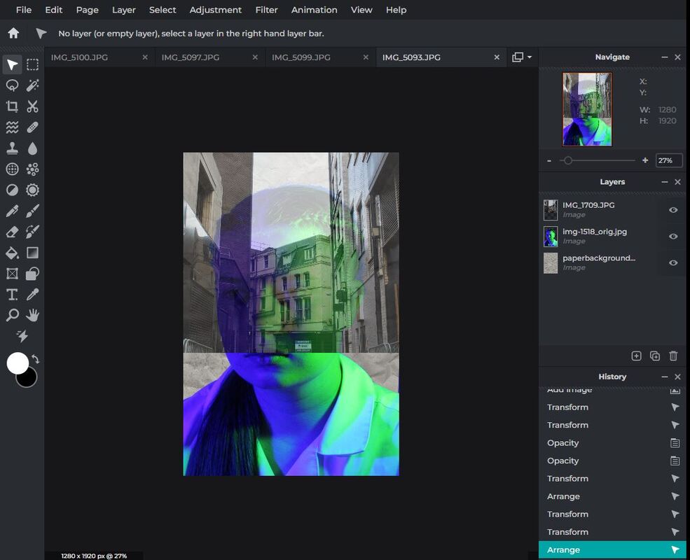
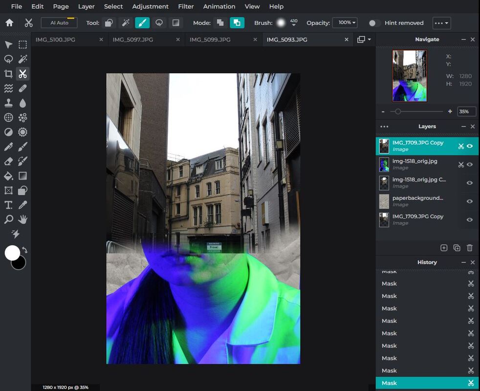
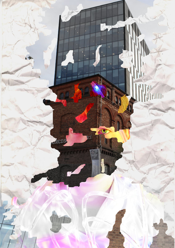
My first image was inspired by Antonio Mora. I put a white piece of crinkled paper as my background and desaturated/adjusted its brightness and contrast so it was a dull grey. Then I put my portrait over the top, removed the background and gave it the same dull monochromatic look. After adding my Liverpool image I made the same adjustments, and then softly removed the edges so it blended into the paper. I moved the portrait layer to the top and used the same brush with a low opacity, high softness and large size to chip away at the layer so it blends in and you can see the building under it. As a strength, the skin blends nicely into the stone and the colours match. As a limitation, I couldn't get all of the green and purple tint off the portrait, so you can see where the layers separate, however I did go back and change this. I changed my portrait image mid way through this edit, because it was being difficult and I couldn't let the background off without it looking messy, however I think the new image turned out better.
The next image was inspired by Andrea Costanin. This time I layered up some stock images of ripped paper on top of my Liverpool image and combined them, and then using the mask overlay type to make a silhouette. To finish I did the same thing as I did in the last edit, slowly removing the Liverpool layer to fade into the portrait, and blurred out the edges of the face and the paper. The Liverpool image used inspired me, because it was of an old and a new building, with a sign talking about the future. To develop this, I kept the saturation low where the building faded into the face, and then increased the saturation slowly as you go away from the centre of the old building, and I kept the modern structure in full colour, to make an old to new looking fade. It also helps that the colour of the two buildings are contrasting. As a strength, I think this edit worked out really well considering it is my first time trying this technique, and I had to develop my own editing process. I was also able to add more intention with this edit. As a limitation, this was a difficult edit to complete, because it proved hard to find the right shape of paper to use as an overlay, and blending it into the face like the original photographer did was very awkward, so I adapted this to have a fade instead of a clean cut between layers. With these limitations I decided to only do one of these edit types.
For the last image I was again replicating Antonia Mora's work. I followed the same process as the first image, apart from this time having the Liverpool image as the top layer. I really like the way the building fades into the background as well as the portrait, and how the lines of the brick align with some of the facial features. This was by far the easiest edit, because the background of the portrait was easier to remove, and I was able to use a YouTube video to help develop my editing process, although I did have to improvise at times. The Liverpool image had lots of simple colours and was clear. The tube lights image worked well because there wasn't an overwhelming amount of tube lights, which would have made editing a lot harder I like how the edges are misty and fade into each other. As a limitation, this edit is a bit basic. To improve I could have duplicated this and made a symmetrical outcome, or used more layers.
Editing Timeline:
Here are screenshots from each key step of the editing process for my work based on Antonio Mora.
|
Using the lasso tool and the cut-out tool (more specifically the draw mask brush tool) to erase the background and any distorted areas:
|
Adding in the paper background I made and adjusting its hue, saturation, brightness and shadows to match the exposure of my portrait:
|
Changing my portrait image, deleting the background and adding in chosen Liverpool image. Adjusting position to suit:

|
|
Making Liverpool layer transparent (a basic overlay) so I can see portrait and changing position so parts align with the face:
|
Using the draw mask tool in a large size, softness, and low opacity, and fading the harsh edges into the background and into the face:
|
Using the filter setting in 'Too Old' and 'Tom to make all layers the same colour (so it looks cohesive)/heavily desaturating the portrait:
|
Developing edits:
After reviewing my first set of multi exposure edits I have decided they need further development. As an example my second edit was basic and is a little dull. The paper cut out of the building was an emulation of Andrea Costain's work, but I think by using a few other tools I could make my edits look more exciting. My third image is inspired by Antonio Mora, and although the fade from portrait to building was successful, the image is too top heavy and needs more elements. With this being a mock exam, after facing some setbacks I had to make some choices like not doing more editing, or straying from my plan which in another case I may have avoided. I would say Antonia Mora was easier to emulate, because I didn't have to mess around with using multiple overlays. I made the decision to make my edits in monochrome because the natural lighting and colours from the Liverpool shoot, and the vibrant, artificial colours from the light workshop shoot were too hard to blend in the way I wanted, and making it monochrome would give me a cleaner finish. Now I am going to improve or recreate some of my edits.
Updated edits:

|

|
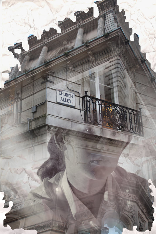
To update this edit, I used the lasso tool in free mode to draw various abstract shapes around the image, then using the exposure tool I bleached them white. I took this idea from the Andrea Costanin images where you use a ripped paper like shape to block off parts of the image. After I took a copy of the original image and used the sampi filter to change the hue. Then I used the overlay layering mode to create a combination. To finish, I took the original image, rotated it symmetrically and overlaid it on top. You can see this by there now being a pattern on the neck of the subject. I really like how the filter makes the paper look old and dirty, it matches the photo of an alley blended onto it.

|

|

|

|
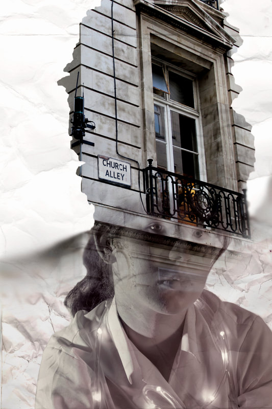
For this edit, I started from scratch with a different portrait. The problem with the original was I used a stock photo of a ripped piece of paper for my overlay, so it limited my creativity and didn't look like the work of Andrea Costanin. To combat this, I put an empty layer above the building image and drew various abstract shapes to create an outline that roughly followed the outline of the subject's face, and filled these areas in white. Then, I put a copy of the paper background image I made underneath and used the mask overlay mode to make all the background the white paper. To emphasise the ripped paper effect, I used the lasso tool to cut out small areas of the building to reveal the portrait below, instead of using the brush tool to fade, which is a method inspired my Antonio Mora. In the original I experimented with hue and saturation to reflect the difference in the modern and the old style buildings. I continued this in my recreation, by nt only fading from low to high saturations on the building, but on the portrait too. I did this by using the lasso tool to select areas of the image, setting the feather to 100 so there wasn't a sharp edge, and changing the saturation. You can see the saturation change as you glance up and down the edit. I had another picture of this building from a different angle, so I included it briefly at the bottom of the image to use up some white space. To make my rotational edit, I doubled the width and height of the page and duplicated the edit to make a symmetrical rotation, then I overlaid the new edit over the top and used the lasso tool again to cut out abstract shapes. I am glad my original idea didn't go to plan, because I think starting over with this edit was a good idea and the end product looks more developed. I was also able to use this technique to spice up my other outcomes.

|

|
This edit was originally inspired by Antonio Mora. The problem with the original was that it was too top heavy on the Liverpool image, so I fixed this by layering another picture of a building onto it, and putting some more of the paper background on top. For my second developed edit, I decided to reuse the techniques learnt from my Andrea Costanin edit, and made another abstract outline. Instead of making the background all the same shade of white, I faded a darker paper into a lighter paper. I think this edit highlights the building better even though not as much is visible as in the original. I tried not to change the colours of the building too much, but I kept the portrait as monochromatic because it made it easier to blend layers smoothly, which was done using the draw mask tool with a low opacity and high softness. On the top right you can see another version of the original outcome, where I did a basic rotational symmetry, and then used the liquify tool to create a strange warped effect. I really like it because it has a strange pattern and you can see all the colours, as well as the tube lights in the center.
Extra edits:
These images are not inspired by an artist, but to further explore the technique of multi=exposure, I used online tutorials to create some extra examples of multi-exposure. For the monochromatic one, I removed the background of the portrait using the lasso tool in polygon mode, and then added the Liverpool image on top. I chose this image because of the leading lines and patterns. I then layered the opacity of the layer and traced the outline of the head with the same tool and cut out anything outside the head. I used the brush mask tool with a low opacity to reveal parts of the face and soften the edge of the head to the background. Finally, I used the picker tool to change the colour of the paper background to one of the darker shades in the train station picture. When I look at this edit I get an idea of a complex mind.
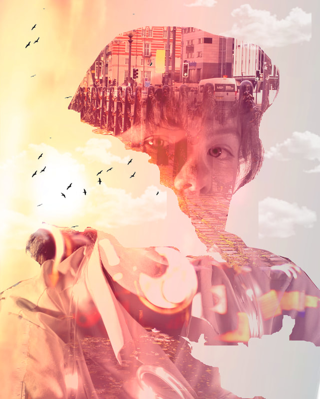
The second edit was complicated. I started by removing the background of the portrait and did the same as before, where you cut out the Liverpool image to fit the shape of the head. Then, I used the lasso tool to cut a section out of both pictures, and carried on this tear without cutting out the railing chain at the front, which creates a leading line to the back of the Liverpool picture. I used the overlay tool and the brush mask tool to reveal parts of the model's face and clothes, Then I took two pictures of a sunset. I used h first on with overlay option lighten, and the second one with multiply, positioning the suns to go in the tear I made in the portrait. I was concerned the portrait was going to be overshadowed by the sunset because it didn't look as bold, but after adjusting the hue, saturation and applying a filter it looked good. To finish off, I added some overlays of birds and clouds. Maybe this edit could be seen as an open mind, and the one on the left as a fixed mind because of all the bars and the black and white, compared to the vibrant array of colours.
The second edit was complicated. I started by removing the background of the portrait and did the same as before, where you cut out the Liverpool image to fit the shape of the head. Then, I used the lasso tool to cut a section out of both pictures, and carried on this tear without cutting out the railing chain at the front, which creates a leading line to the back of the Liverpool picture. I used the overlay tool and the brush mask tool to reveal parts of the model's face and clothes, Then I took two pictures of a sunset. I used h first on with overlay option lighten, and the second one with multiply, positioning the suns to go in the tear I made in the portrait. I was concerned the portrait was going to be overshadowed by the sunset because it didn't look as bold, but after adjusting the hue, saturation and applying a filter it looked good. To finish off, I added some overlays of birds and clouds. Maybe this edit could be seen as an open mind, and the one on the left as a fixed mind because of all the bars and the black and white, compared to the vibrant array of colours.

|
|
Final Outcome:
This is my final outcome for the digital composition. I have chosen it because it has so many layers to it, from using multiple Liverpool images and the experimentation with saturation. I think the ripped paper effect was really successful and from the original to the updated version there has been the most development in this image. To me it is like the tube lights are feeding colour into the image that was desaturated before. There has been a lot of trial and error with this image, and deciding between using various overlay techniques to remove tools expanded my editing knowledge and had a positive impact on other edits.
To summarise this composition, I enjoyed connecting two different points of the project. I think the feedback I received on my first edits helped to make the developed ones really successful, and closer to the original artists' work. A strong limitation for these edits .was probably removing the backgrounds of the original portraits, because I chose to use some backgrounds I had created to fit the theme. Because the portraits came from the colour gels and tube lighting shoots, the backgrounds and the models were multicoloured, and I had to manually trace the body and the tube lights to get a clean cut. I also found it difficult when editing because there was no specific online tutorial to follow to get an edit that looked like my artists' work, specifically Andrea Costanin, so I had to test different tools. I like that although I had two different artists, combing them was a good form of development for my edits.
To summarise this composition, I enjoyed connecting two different points of the project. I think the feedback I received on my first edits helped to make the developed ones really successful, and closer to the original artists' work. A strong limitation for these edits .was probably removing the backgrounds of the original portraits, because I chose to use some backgrounds I had created to fit the theme. Because the portraits came from the colour gels and tube lighting shoots, the backgrounds and the models were multicoloured, and I had to manually trace the body and the tube lights to get a clean cut. I also found it difficult when editing because there was no specific online tutorial to follow to get an edit that looked like my artists' work, specifically Andrea Costanin, so I had to test different tools. I like that although I had two different artists, combing them was a good form of development for my edits.
Further Photography - Exploring Portraiture
Throughout this project I have explored many different aspects of photography and portraiture. Now, I want to showcase some of the work I have done outside of the GCSE course, building off my knowledge from this project.
|
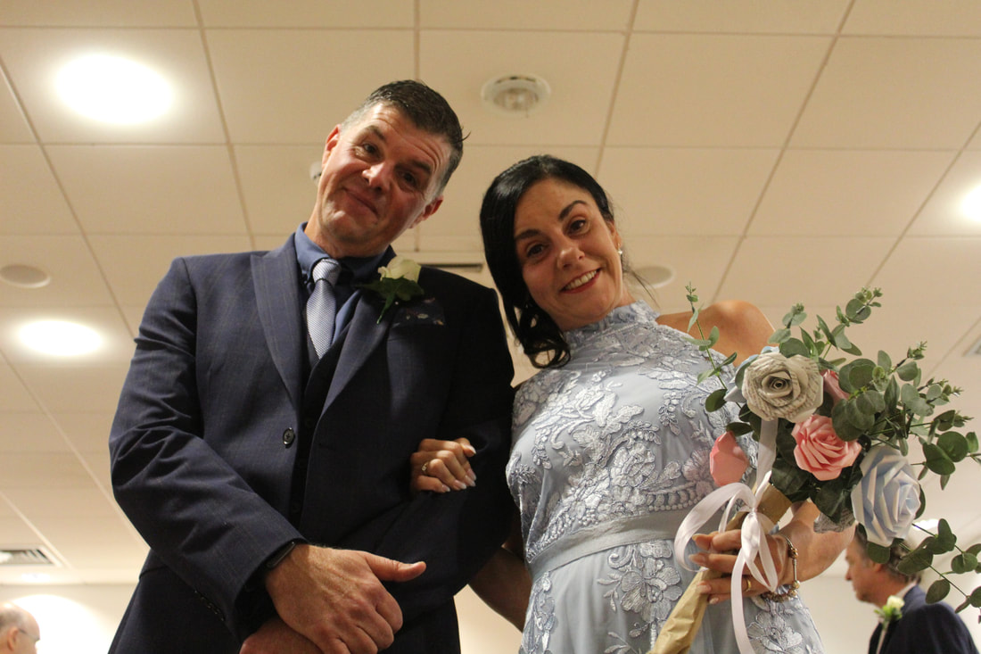
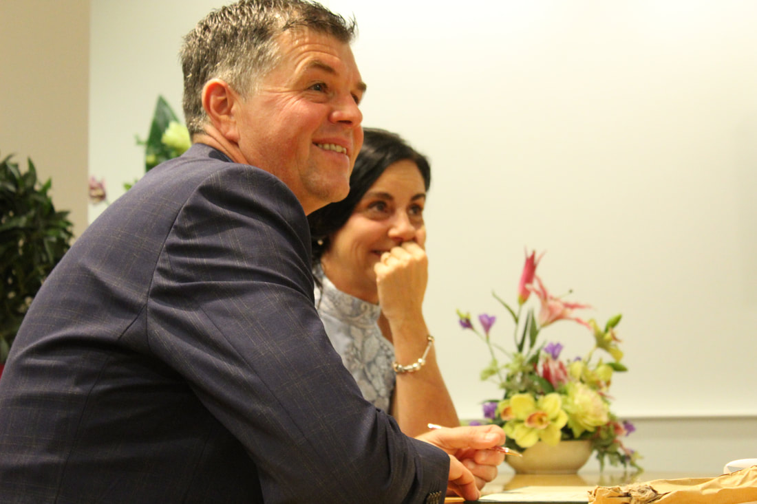
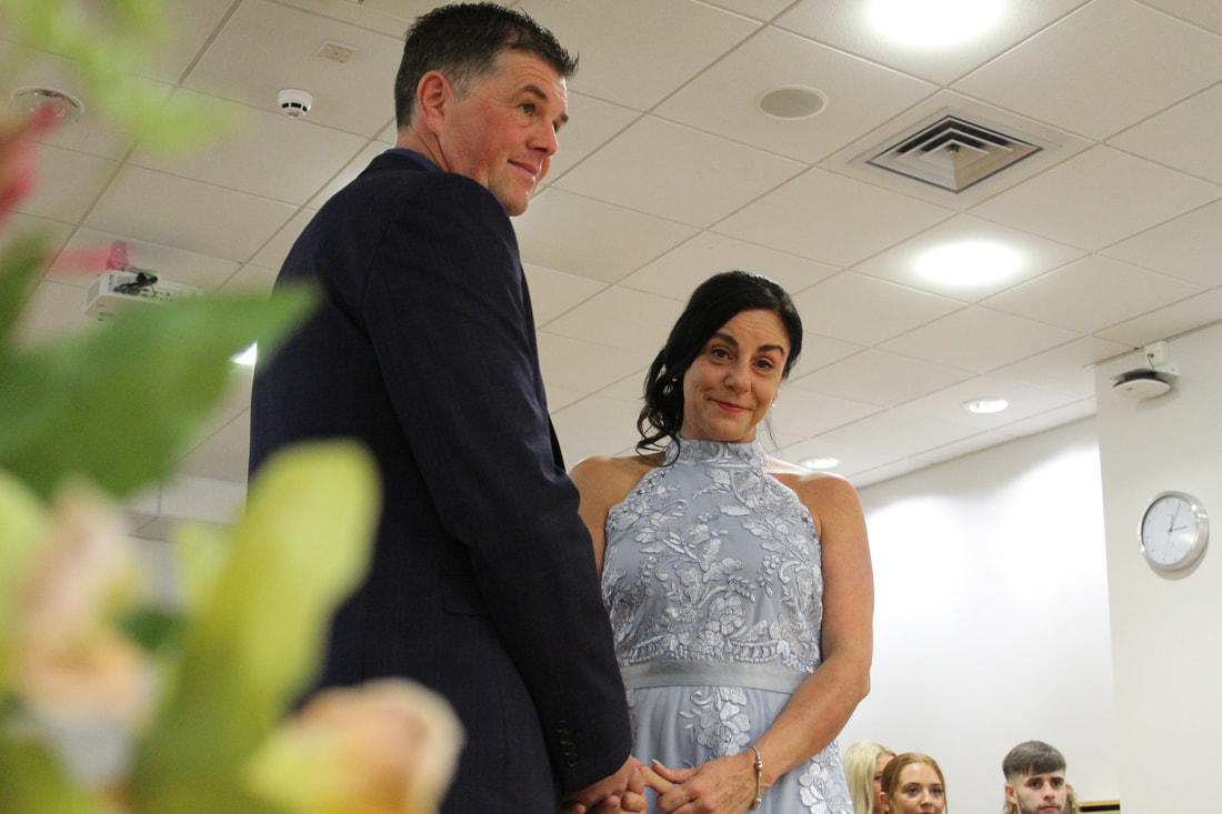
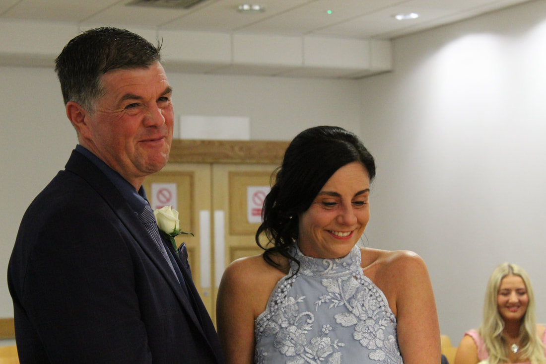
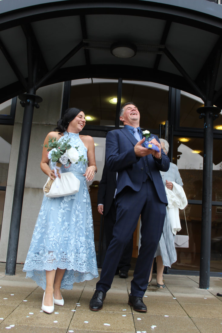
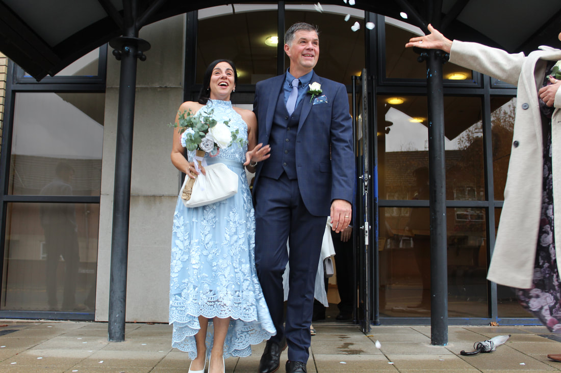
Wedding photos:
In my exploration of portraiture, I found myself as the main photographer for an actual, not staged wedding. This experience was challenging because I found myself without a tripod or lighting that I was able to control, and capturing moments as they happened was hard, as opposed to creating a freeze frame. I had to adapt to moving around my subjects, instead of positioning them around me. Working outside of a studio, with no shoot plan proved to be difficult, and I had to improvise my camera settings depending on location, lighting, and time of day. This experience made me appreciate the thought process of all the shoots I have done so far, where you carefully plan out the composition to create a certain emotion. However, I would say this shoot was a huge success, and I am going to highlight my most successful images below. I have actually been asked to photograph another wedding since this. |

|

|
|
London photos:
In this project I have also focused on architecture and buildings in my Liverpool shoot, as a compliment to my digital composition. However, when I travelled to London, I wanted to show off the architecture of London as its own focus. Below are some of my best images from my visit to London, including some of various art pieces I was fortunate to see.
In this project I have also focused on architecture and buildings in my Liverpool shoot, as a compliment to my digital composition. However, when I travelled to London, I wanted to show off the architecture of London as its own focus. Below are some of my best images from my visit to London, including some of various art pieces I was fortunate to see.

|

|
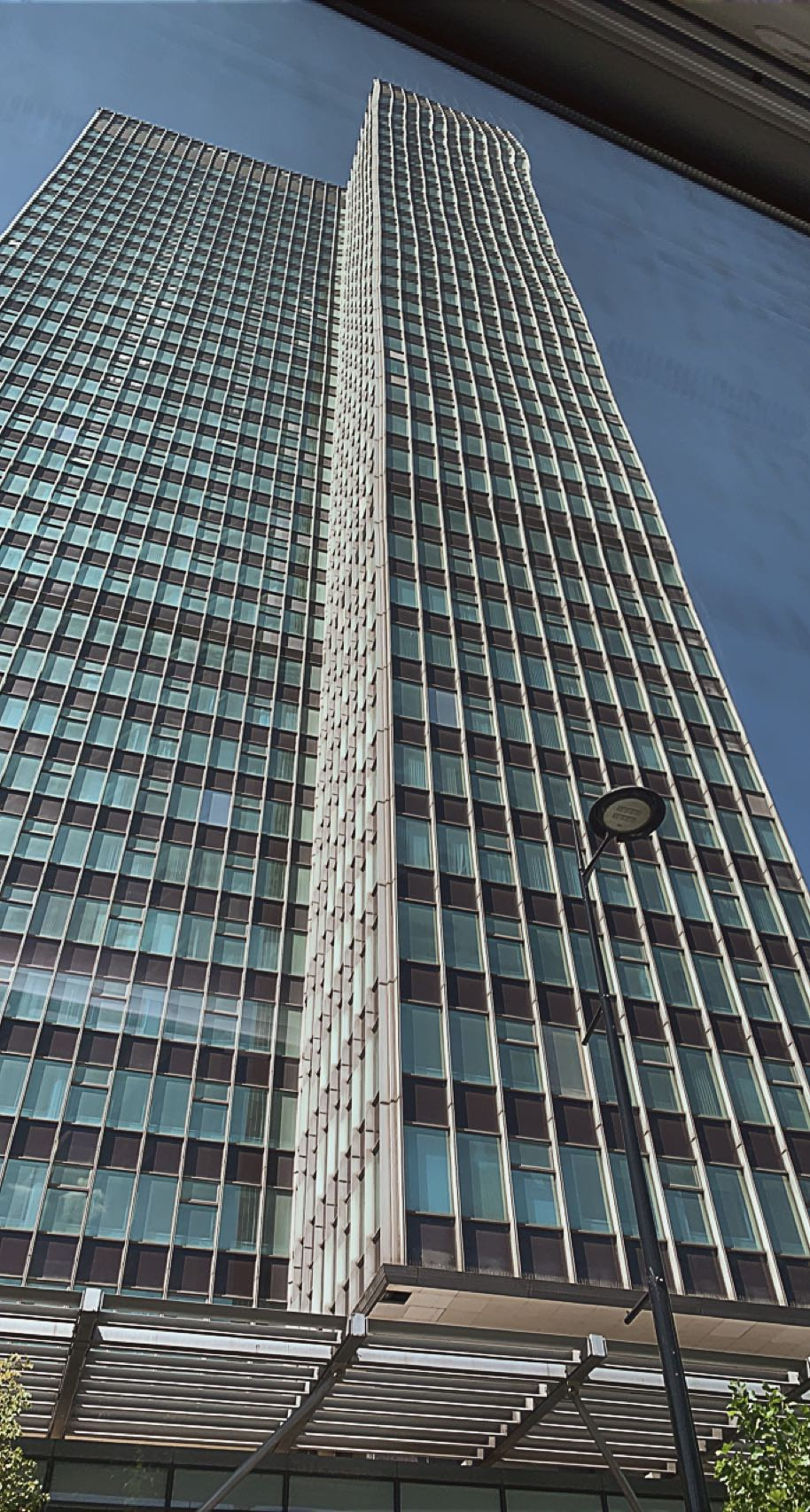
|
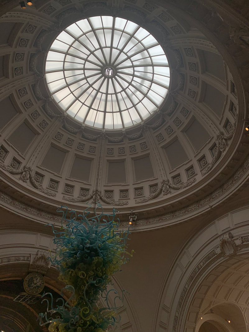
|

|
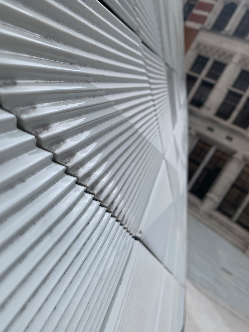
|

|
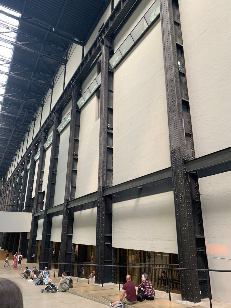
|

|
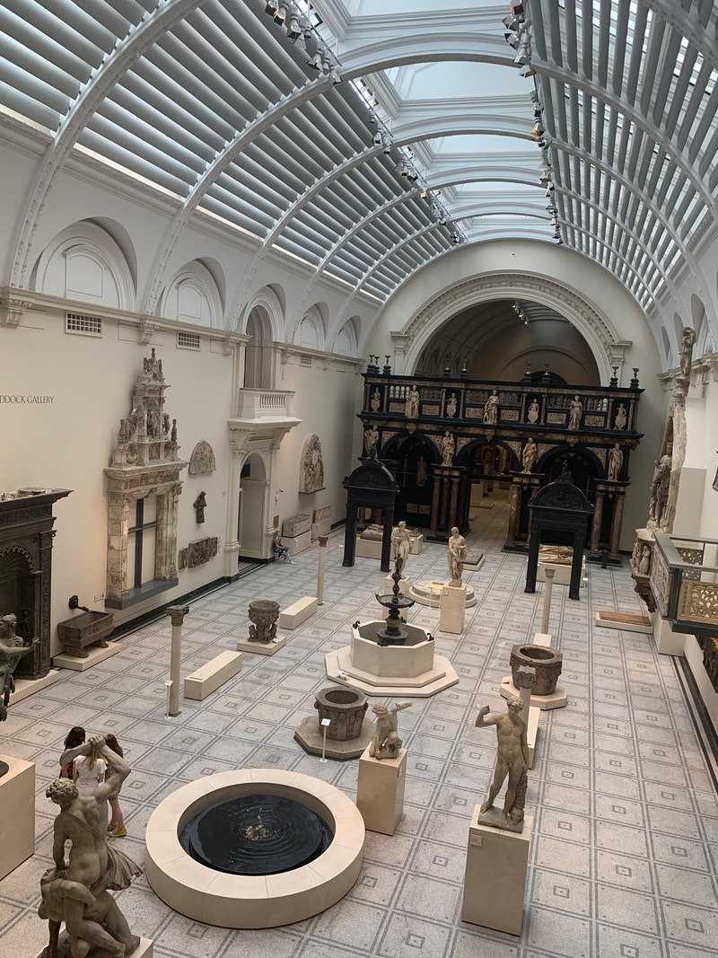
|
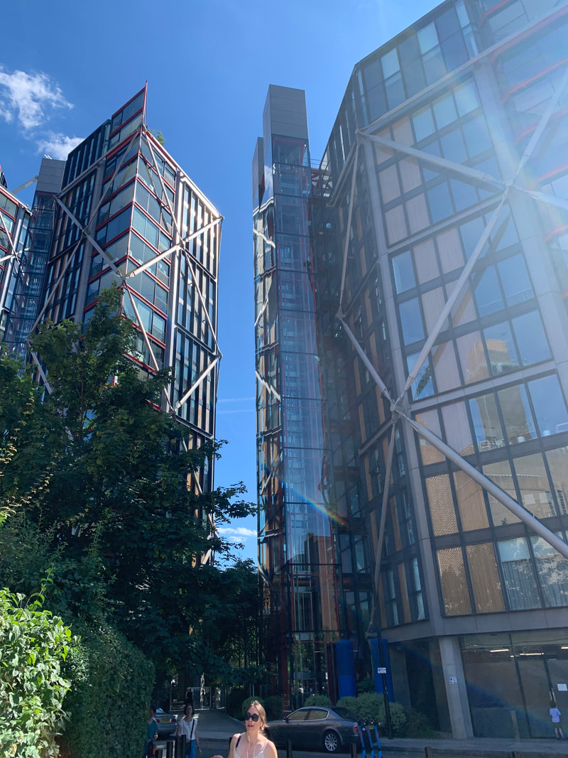
|
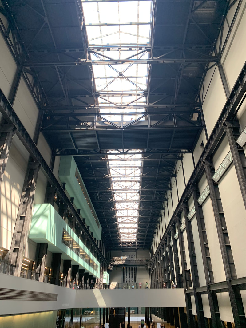
|
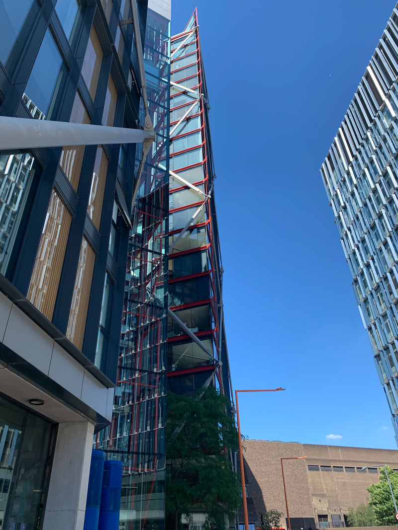
|

|

|
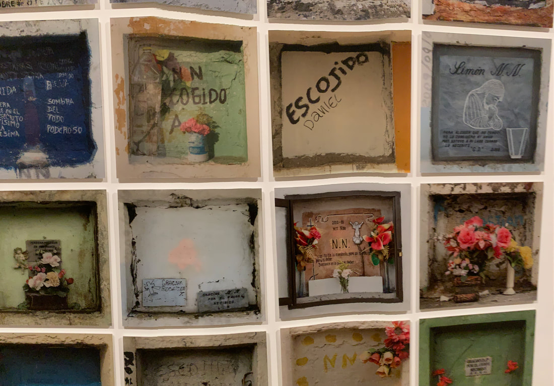
|
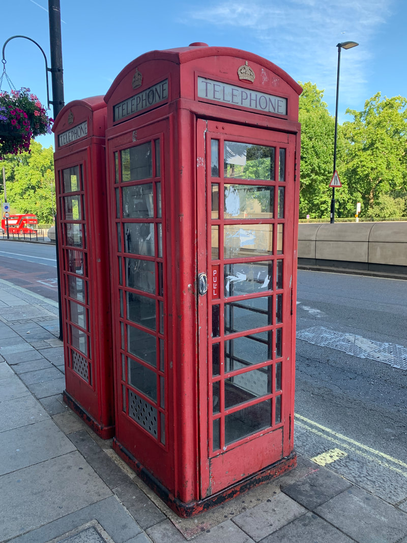
|
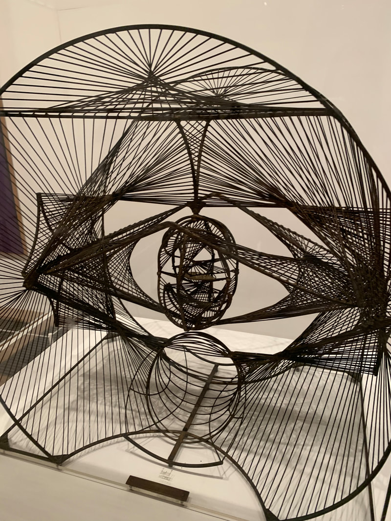
|
Evaluation
During this project I have developed my understanding of portraiture photography by exploring the theme of identity, more specifically concealing and revealing images to emphasise intention. Additionally, I have expanded my knowledge through multiple compositions and artist inspired emulations, as well as experimentation with different photographic techniques/materials. For example, if you look at the mind maps at the start of this project, you can see I have further researched various artists and techniques like remove, multi-exposure and motion blur.
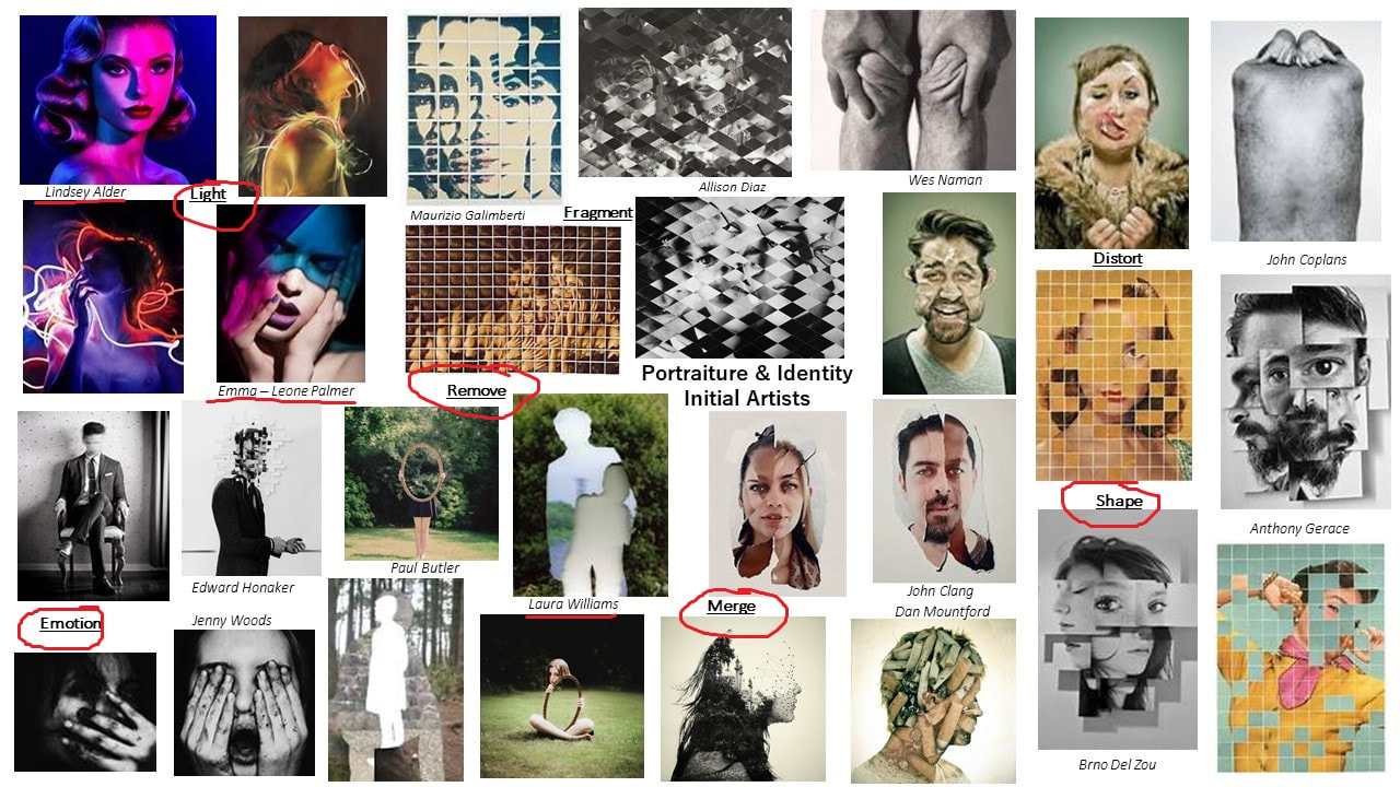
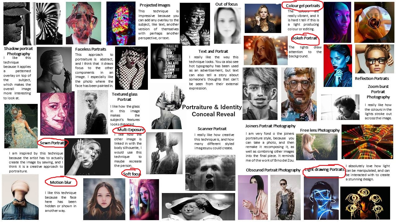
My first shoot of this project was the series of light experiments using different technical processes, starting with the bokeh lights shoot. It is fascinating how light can be employed t create a vast range of emotion and intent. I didn't specifically research the work of any artists in which my images would be an emulation of, however an artist who does create these types of outcomes is Brandon Woelful. For this shoot I used equipment like DSLR camera with a prime 50mm lens. When you use bokeh lighting, the most effective camera angles are close up and full body. You can use the small lights and modify the size, position and colour to induce intent into the image, or use them to make the background more interesting. For instance, in my bokeh shoot I shot close up to the subject, placed the lights in the middle ground and foreground, and used manual focus to intentionally make some of the lights blow up. These lights are really successful in compositions with a shallow depth of field, so I used a lower aperture to blur the background.
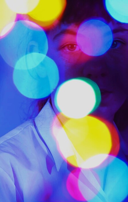
|

|
Initially I researched the work of Emma-Leone Palmer, because I was inspired by her manipulation of light (light drawing). She connected with our conceal and reveal focus because she was able to hide aspects of the model using light, a tool she used to create intention in her work, and also uses a rule of thirds composition and simplifies her background to eliminate distraction from the focal point. Through studying this artist, I was able to explore concepts of colour, form and contrast, and explore the technique of long exposure to amplify the lighting in a picture. Inspired by their work, I created a series of emulations in our light workshops, where I experimented with equipment like tube lights and backdrops. I differed slightly because I employed a coloured backdrop instead of black, but I still positioned the tube lights to create an effect. I investigated the technical process of RGB colour gels. Their work helped me understand the theme of portrait & identity because I had to consider what I wanted the person seeing the image to think, which wasn't really a concern in the last project.

|

|
Next I focused on the work of Lindsay Adler. Unlike Emma-Leone Palmer, she is solely focused on colour gels, and uses the light to create sharp edges on the model, and through her, I explored concepts of colour and space. Inspired by their work, I created a series of emulations, using a mix of colour gels, placing coloured cellophane over regular lights to produce colour, and using RGB lights to customise colours. I also used soft box lighting and tripods, with a shutter release cable. I investigated the technical process of motion blur, where you create a blurred effect by shaking the camera softly, or having the subject move their head in different directions. This caused for experimentation with shutter speed and aperture. I complimented this shoot with an extra out of school shoot, but my best outcomes were edited on Pixlr and displayed as final outcomes. Lindsay Adler's work helped me understand the theme of portrait & identity because I used the technical processes of colour and motion blur to create meaning, and as a photographer I got experience with equipment I haven't used before.

|

|
Afterwards I studied Laura Williams, my personal favourite photographer, chosen because her use of the remove technique linked really well with out conceal & reveal focus. This artist uses digital editing, which is easier for me than physical editing. Through studying this artist, I was able to explore concepts of narrative and surrealism. From her work I created a series of emulations based off her mirror optical illusion, which expanded my digital editing skills and gave me experience with using overlays and tools to merge layers. After recreating her mirror illusion, I took a handful of images from her portfolio and tried to emulate them with my own experience. Laura's work furthered my understanding of portrait & identity because using the remove technique opened up opportunities to explore intentions and interpretations for my work, as well as exploring the multiple layering technique.

|
|
Moving on in this project we stepped away from doing shoots and then editing on Pixlr and I completed two physical compositions. The first one was focused on the collaging technique, developing my outcomes from Laura Williams. I wanted to reinforce the sense of ambiguity, so I used the laser cutter to create lots of circular and abstract shapes, and used the guillotine to make paper strips sticking to the colour scheme of my original image, as well as incorporating a monochrome version. I cut some book pages into circles and added them too. There was a lot of trial and error for this composition, and I had to abandon one piece because I tried to cut into it to make a 3D piece, which was unsuccessful. I am glad this happened though because it allowed me to use one large image, and many smaller collages, and stick them all down on a piece of mountboard to make one large outcome, which looked better in the end because there was room to add on. After finishing the first physical edit I scanned it onto the computer and experimented digitally, creating several rotational pieces and one digital collage including images from each step of the process. This composition is looking at memory in my opinion, because I distorted parts of my final outcome to make them appear distant to the viewer.
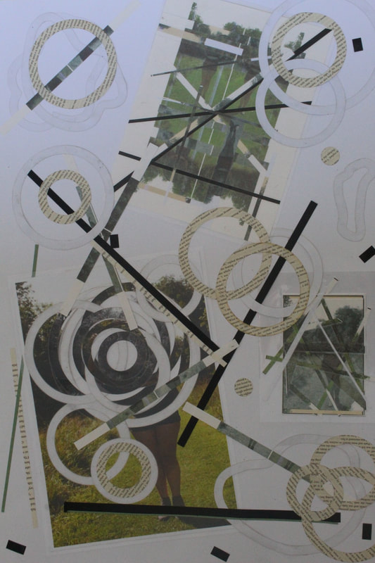
|

|
For the second physical edit I was inspired by the work of Maurizio Anzeri, and explored physical editing techniques like sewing, and layering. For this composition I worked with an image from my tube light experiments shoot. I followed the same process as before, laser cutting various pieces of paper and collaging them together onto one large image, but this time I chose some colours like the ones from my original image and sewed into the piece to create a patched up look. I was going for a hidden identity look, so the gaps in the image show the areas the person doesn't want you to see, and the thread is showing the fragments you can see. It adds to the conceal focus. I sewed across the gaps and along some of the paper shapes, and then scanned in my physical edit and rotated it, making some checker board looking edits and a rotate of a cropped physical edit. To further develop my outcomes, these edits were then sublimated onto thick mountboard and I stuck them together into a cube, my final 3D final outcome for this composition.

|

|
These compositions helped me understand understand the theme of portrait and identity because I used lots of techniques like removing and fragmenting, equipment like a laser cutter and guillotine, as well as employing several elements of art and photography like colour, form and contrast, to create intention in my work.
Next I completed a digital composition, a series of edits emulating the work of Antonio Mora and Andrea Costanin. Through these artists I explored concepts of shape, space, form and colour mainly. I completed a Liverpool shoot focusing on all the different types of architecture, and practicing the motion blur technique, combining my favourite images with images from another shoot in the project, the light experiments shoots (primarily the tube lights and colour gels shoot). On Pixlr, I mainly used the crop, lasso, brush mask and fill tool, and used the exposure, hue & saturation and highlights & shadows adjustments. I also used a lot of different layering options. I focused on the head of the subject so I could expand on my idea of imagination and mindset. Specifically, I demonstrated a contrast in mindsets in my extra edits showing an open and fixed mindset. In this composition/exam, I faced setbacks that I overcame with further development to my edits and my digital editing skills have improved now. This composition and the research of my artists broadened my knowledge of portrait & identity by using different images, as well as a range of hues, filters and tools to create intent in my work.

|

|

|

Chosen final outcome for this project
|
I found it very difficult to choose a most successful outcome for this project, there has been so much development of my skills throughout, and there are certainly outcomes that have required more complicated editing skills, however I have chosen this image from the colour gels and motion blur light experiments shoot as my most successful outcome, because I feel it encapsulates the conceal and reveal focus of this project. The hands are placed perfectly and cast the idea that the subject wants to be hidden but are being exposed by the translucent hands. When evaluating this image earlier on in the project I talked about how this image could have different interpretations. One might say the subject is being manipulative by pretending to be upset, or perhaps they are being deceiving by pretending to be naïve or scared, when in reality they are bold or devious. To emphasise why this image is successful I must comment on how the subject fits in the rule of thirds composition and they are not surrounded by empty space that takes away from the focus (correct framing). The photo is exposed properly and has rich, contrasting colours that add to the idea of a double meaning. In further editing I deepened the colours and made the subject appear almost reflective on the side of her head, almost too bright but not overpowering to where it may appear a fault. The camera angle was eye level which was most effective, and the subject is the only thing which simplifies the composition and prevents unnecessary distraction. The aperture here was around f8 for a larger depth of field/focus, and the shutter speed for 1-2 seconds, perfect for this motion blur. Sometimes the most effective portraits are the simplest, because there is more space for the imagination to fill in.
One of the last things I did in this project was my own independent exploration of portraiture. I included my experience with photographing a wedding and the challenges that presented me with, and then I explored more building photography through my trip to London. This further development let me be more creative with my photography because I didn't have to build off the work of an artist, but it also gave me natural experience outside of a classroom.
One of the last things I did in this project was my own independent exploration of portraiture. I included my experience with photographing a wedding and the challenges that presented me with, and then I explored more building photography through my trip to London. This further development let me be more creative with my photography because I didn't have to build off the work of an artist, but it also gave me natural experience outside of a classroom.
To conclude this project I want to consider my areas of weakness, and the skills I need to improve on moving forward. The first thing I would like to note is that my contact sheets could use more annotation, however they have improved since the las project because I mentioned this as a weakness in my last evaluation.. I have commonly used phrases like overexposed to explain failed images, and I think future shoots could benefit from more information like how to prevent overexposure by using histograms and being more confident with camera settings so not as much editing is needed. I would also like to reduce the amount of unintentionally blurred shots I encounter in my shoots, which is why a tripod is very useful, however they can not be used at all times. Additionally, I think that although it is good that I can often recover from setbacks and improve my work, I should work harder at having clear plan from the start, because I have a tendency to lose my way and stray from my original ideas because I overcomplicate my ideas. From a technical standpoint, mu use of the rule of thirds grid could be increased, although this hasn't caused me any problems so far. In the last project I complained of limited digital editing skills on Pixlr. In contrast, now I have developed several digital and physical editing skills like using layering modes and tools to create multi-exposure, and using equipment like a heat press, guillotine and laser cutter. In the next project I also want to experiment with different camera angles like birds eye view or full body (long distance).
Further Edits / Daniel Egnéus
|
Daniel Egnéus is a 51 year old artist who focuses his work on the architecture of Athens. Aside from his dreamlike, vibrant landscapes, he also does children book illustrations, but I will be focusing on his landscape work, from his series 'Drawings from an everyday walk in Athens'. He observes that black and white pictures of cities showing hardship doesn't appeal to him, and he finds inspiration in drawing out the bright colours to make his building images look more lively. He is an illustrative artist, and he was voted best illustrator in March 2005 by the Association of Illustrators in the UK. His artwork is multi-layered, and he appears to after taking a photo of a street or building, illustrate over it in solid colours and eliminates textures (for example colouring a whole brick wall white) however reintroduces dimension into his work by layering these solid colours on top of each other, and using a fine pen to illustrate finer details like railings and door frames, which makes his work look more developed and adds realism. He tends to create quite busy outcomes, for example he photographs multiple buildings with lots of objects and people, which is mellowed nicely by the use of simplistic illustration and artistic equipment. I have been inspired by his work and am looking to further develop some of my own building/architecture photography by emulating and interpreting his style of photography for my own work. In a way, he is similar to Emma-Leone Palmer or Dennis Wojtkiewicz, who also photograph and then illustrate (paint) over their work. Photography in this way is great as it allows painters to create realistic or high quality pieces by using photos as a stencil for painting or drawing on.
|
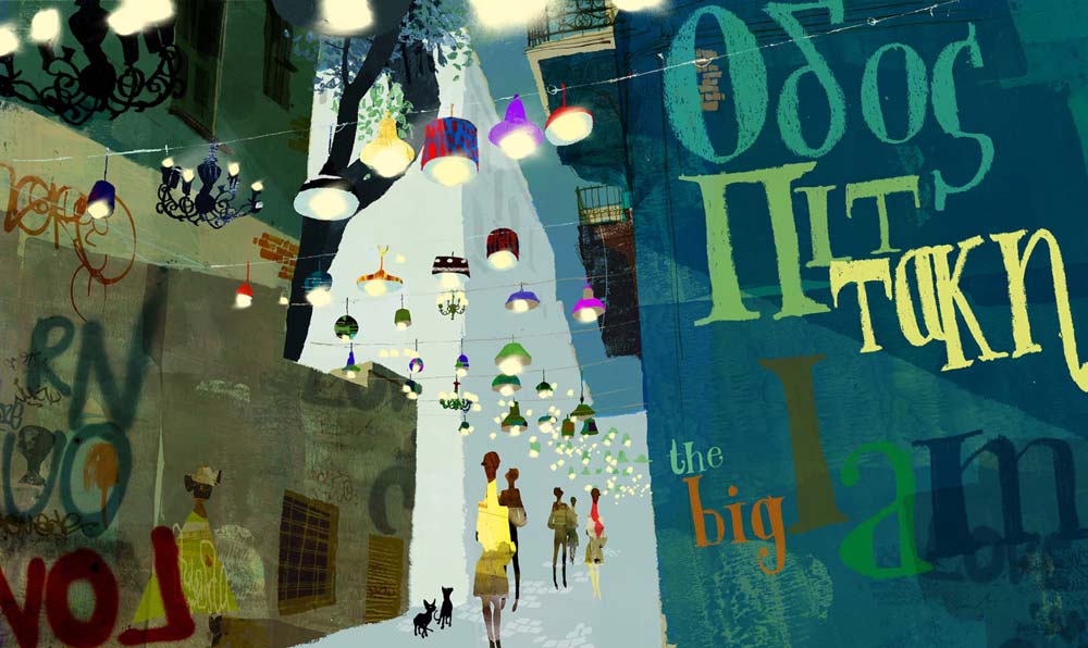
|
Editing process:
I used his work and editing style to further my final outcome from my digital composition, where I combined a portrait from my light tube shoot and my Liverpool architecture shoot. To this final outcome, I physically edited it using another building image from my London architecture shoot, from the independent photography section of this project.
To start this edit, I printed off my final outcome from the digital composition where I had drawn on the key colours in a colour palette, onto glossy paper. Then, I selected 4 of my final outcomes from the London images shoot and printed them onto A3 paper. My main pieces of equipment were the printed building images, several POSCA pens with varying thicknesses, and some laminator sheets (I used these because they are clear and can be layered on top of images to create layered effect. To follow, I placed my building image underneath the laminator sheet, and using a thin, black POSCA pen I outlined various shapes from buildings, lampposts, and key fine details like Egnéus does. I made sure these shapes looked hand drawn and not too rigid, because I wanted them to flow and for the eye to flow with them. I outlined a few shapes from each photo, not too many because I wanted to layer them on top of each other and other images. For the trees and nature in two of the photos, I used a thick, green paint pen to draw an abstract shape, and then used the thin black pen to draw on the leaves and branches using one messy, abstract line. For the image I used featuring the large graffiti filled wall, I outlined some of the key shapes and then, to emulate Egnéus' way of using solid colour shapes, I coloured the windows in solid, bright colours and then also added extra detail in the black pen. I also used the brightly coloured paint pens to enhance beams and structural features onto buildings (the larger details). I mainly used the black paint pen because the idea is to build on to pre-existing colour, and Egnéus also does this. For the paint pens, I matched the colours to the ones that are seen on the colour palette taken from my digital composition, so that it is cohesive and elements of the portrait and digital edit can be seen constantly in the physical one, even if some aspects are covered. Once I had finished outlining and drawing onto the laminator sheets, I laminated each plastic sheet and then set out a large poster board. My idea was to create several mini compositions using my A3 building pictures, my digital composition outcome, and my laminator sheets, and then one large composition. I used a guillotine to slice my building pictures into various shards and also a crat knife to slice more intricate shapes. Then, I collaged and layered my compositions together and continued drawing onto using the paint pens. This further editing was very successful, because I was able to create many outcomes, as well as expand on my editing skills and further develop that original image using more og my work. The end results are cohesive and include aspects of the inspired artists' work, as well as other skills I have developed throughout this project also being shown.
To start this edit, I printed off my final outcome from the digital composition where I had drawn on the key colours in a colour palette, onto glossy paper. Then, I selected 4 of my final outcomes from the London images shoot and printed them onto A3 paper. My main pieces of equipment were the printed building images, several POSCA pens with varying thicknesses, and some laminator sheets (I used these because they are clear and can be layered on top of images to create layered effect. To follow, I placed my building image underneath the laminator sheet, and using a thin, black POSCA pen I outlined various shapes from buildings, lampposts, and key fine details like Egnéus does. I made sure these shapes looked hand drawn and not too rigid, because I wanted them to flow and for the eye to flow with them. I outlined a few shapes from each photo, not too many because I wanted to layer them on top of each other and other images. For the trees and nature in two of the photos, I used a thick, green paint pen to draw an abstract shape, and then used the thin black pen to draw on the leaves and branches using one messy, abstract line. For the image I used featuring the large graffiti filled wall, I outlined some of the key shapes and then, to emulate Egnéus' way of using solid colour shapes, I coloured the windows in solid, bright colours and then also added extra detail in the black pen. I also used the brightly coloured paint pens to enhance beams and structural features onto buildings (the larger details). I mainly used the black paint pen because the idea is to build on to pre-existing colour, and Egnéus also does this. For the paint pens, I matched the colours to the ones that are seen on the colour palette taken from my digital composition, so that it is cohesive and elements of the portrait and digital edit can be seen constantly in the physical one, even if some aspects are covered. Once I had finished outlining and drawing onto the laminator sheets, I laminated each plastic sheet and then set out a large poster board. My idea was to create several mini compositions using my A3 building pictures, my digital composition outcome, and my laminator sheets, and then one large composition. I used a guillotine to slice my building pictures into various shards and also a crat knife to slice more intricate shapes. Then, I collaged and layered my compositions together and continued drawing onto using the paint pens. This further editing was very successful, because I was able to create many outcomes, as well as expand on my editing skills and further develop that original image using more og my work. The end results are cohesive and include aspects of the inspired artists' work, as well as other skills I have developed throughout this project also being shown.
These are the four mages from the London shoot I chose to include in my further editing. I chose the first one because the large beams and the viewpoint of the building are interesting and worked well for layering. I chose the second one because I knew the graffiti would work well for intricate details and would help populate my collage. I chose the third one because of the reflective surfaces and the interesting effect it creates, and the fourth one because it was well populated with shapes and fun things to copy onto the new collage (for example the screens in the front).
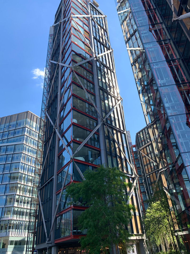
|
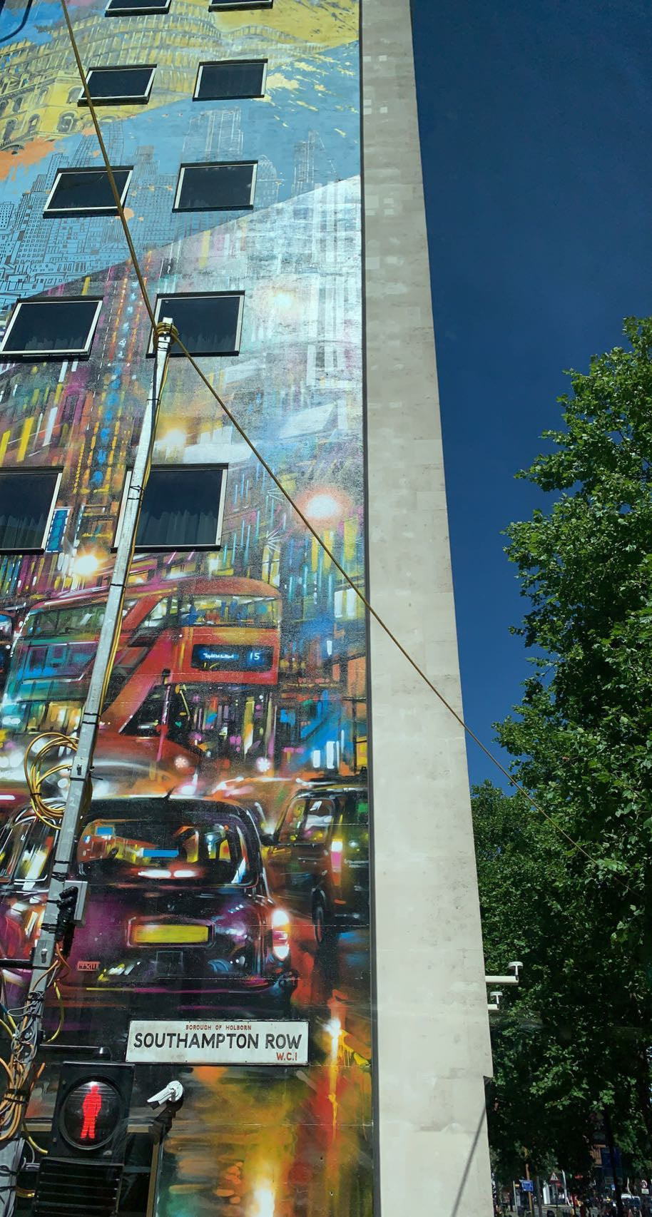
|
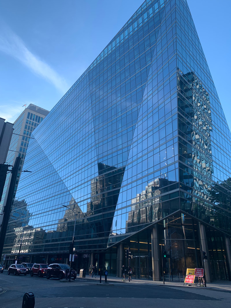
|
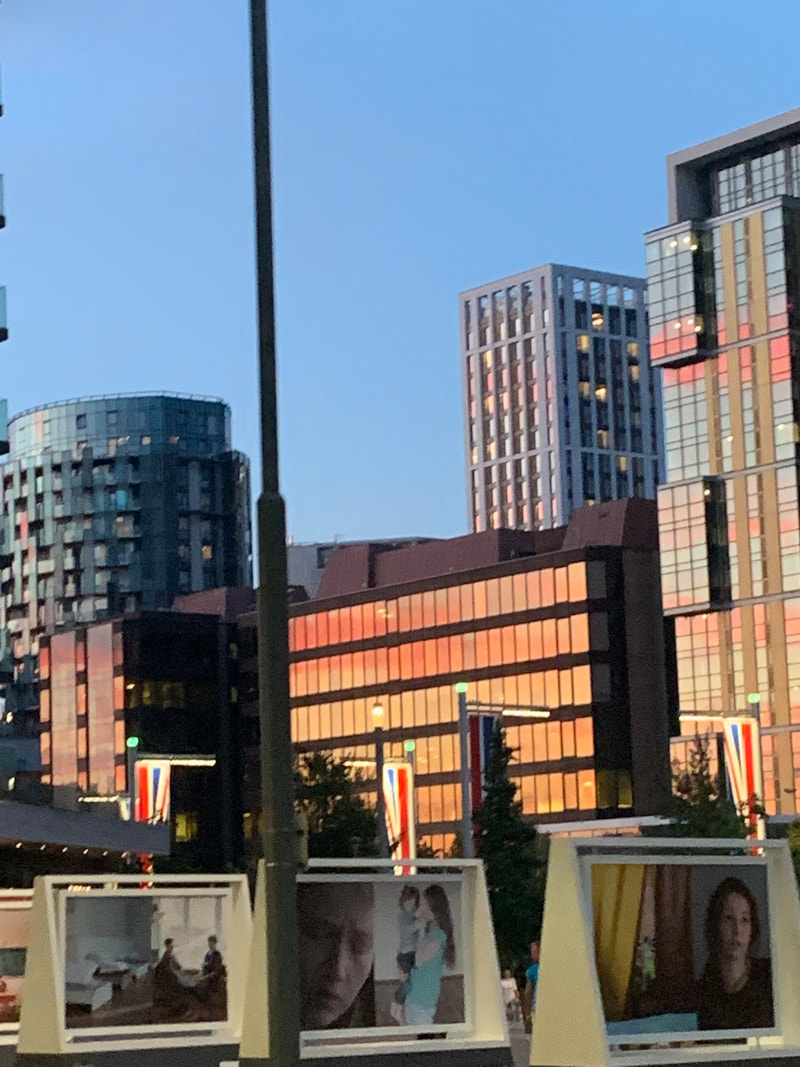
|
Below I have shown three of the images that I drew and painted over, before I began to cut and collage them. The laminator pouches had been laminated at this point, and to cut I used a craft knife and a guillotine. On the right you ca see the POSCA paint pens I used which vary in thickness and colour (which match the colour palette of the original edit).
|

|
Here are the smaller collages and outcomes that were developed during the experimental phase of the further editing process. I made the decision to mostly keep the white borders around the images because I could align them to create a new frame and they outlined my smaller collages.
|
|
Experimenting combining the sliced building images incorporating the portrait from the digital composition:
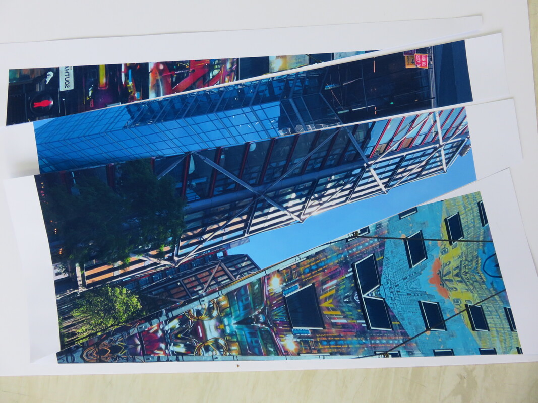
|
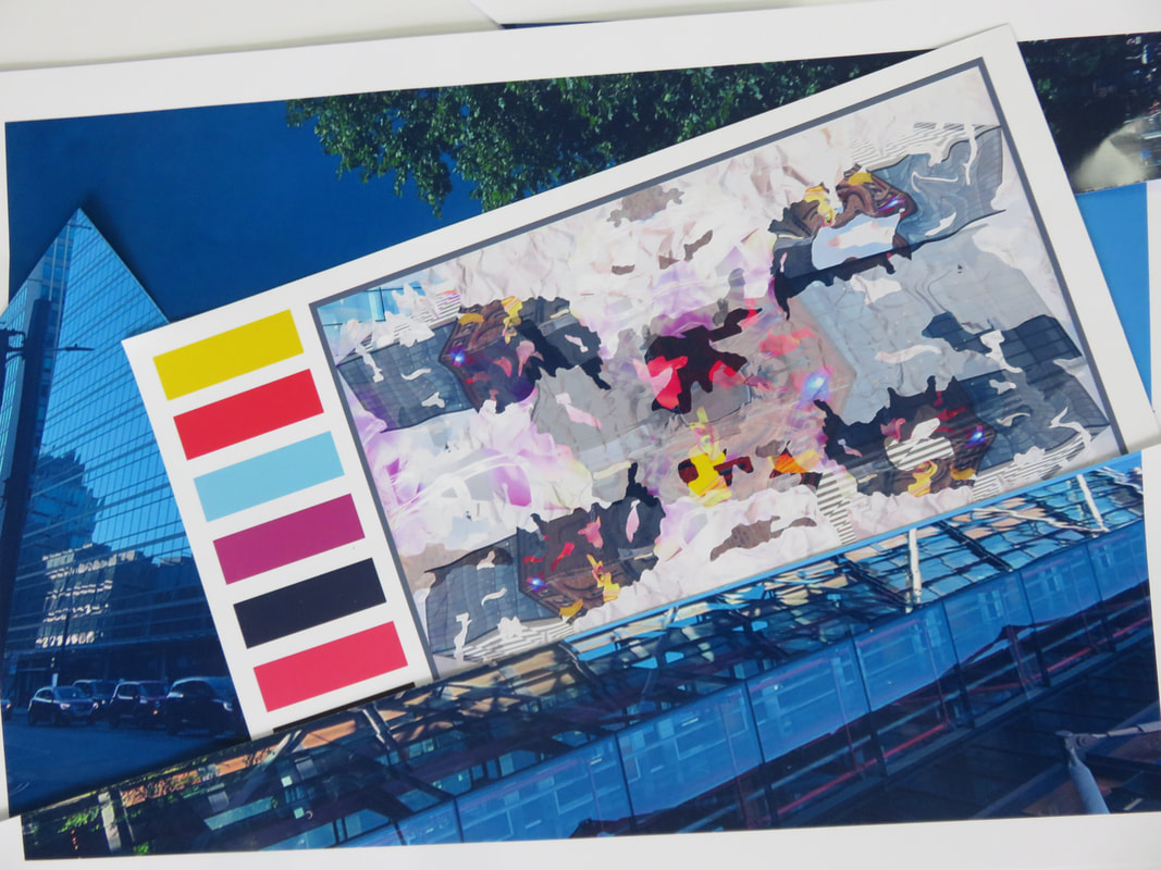
|
Adding on my drawings from one of the building pictures onto the colour palette of the portrait (these images have a more simplistic, blocky effect and they look the most similar to Egnéus' work:
|
|

|
|
This is the image of a wall covered in graffiti, which I painted over and outlined, and then shifted the clear overlay slightly to create a cool 3D layered effect. The reflections on the plastic create cloud like shapes. The outlines of the trees can also be seen. Here is one of the key examples of the blocky colours.
This is the large collage I made from all the components of the further editing stages and the original portrait. I have also included various close-ups to show the cohesion and the finer details.
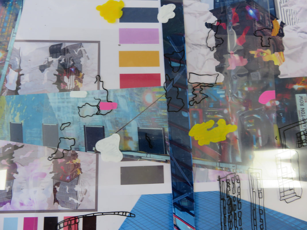
|
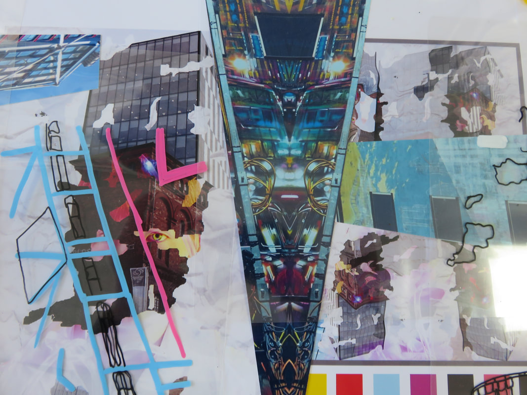
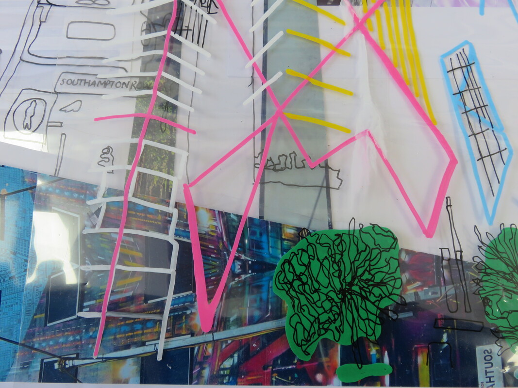
|
Here I have taken the final further edit collage, and have taken two colour swatches from the colours in the original colour palates and the extra paint colours included in this process. I have also drawn on and circled the key areas of the final piece that are recognisable throughout this process (for example I have circled in green the clear overlays and the areas of the original portrait that can be seen.

|

|
